Deepak J.'s Portfolio
Wed
17 Jun
6:24 PM
Title
Description of the title
Title
Description of the title
Title
Description of the title
Title
Description of the title
Title
Description of the title
Title
Description of the title
Title
Description of the title
Title
Description of the title
Title
Description of the title
Title
Description of the title
Title
Description of the title
Title
Description of the title
Title
Description of the title
Title
Description of the title
Museum of Branding
Good branding is supposed to help a brand stand out. Whether it's a product, service, organisation or a cow, that's all it has ever been. From 2000 BC till today.
While the identities here may look very different from one another, they were all built on the same belief: make the brand truly distinguishable, then create a system that makes it memorable.
And like they say, you tend to love all your babies the same.
If you like something here, go and DM them. If you don't, DM me.
An Overview of Branding Projects
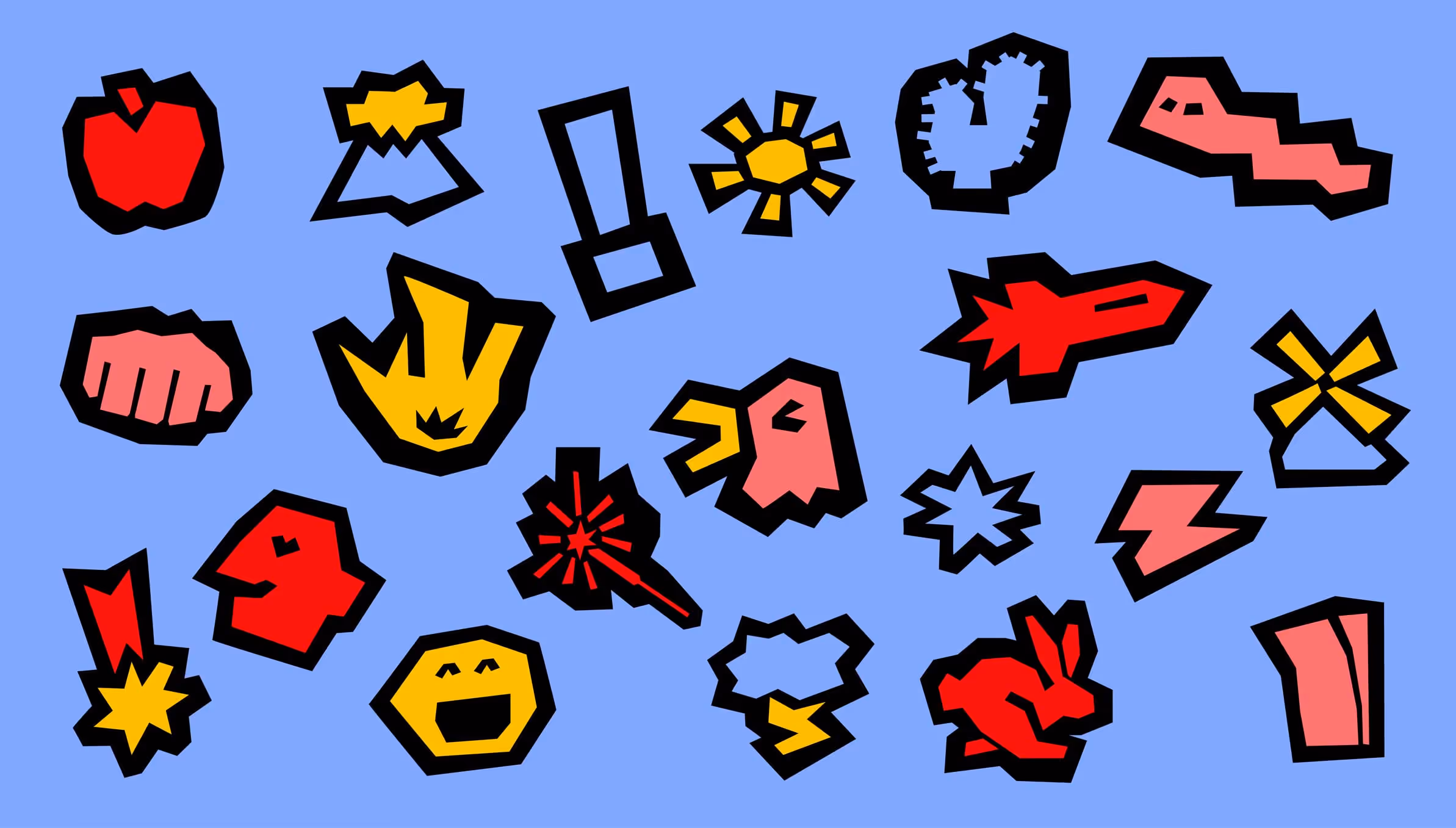
Custom Typefaces
One approach to branding that I have always loved is typography led brands.All brands say things. But when they say those things in a typeface designed specifically to make the brand stronger, that's the good stuff. That's what designers live for, isn't it?
P.S. If you're not a designer, the above "isn't it?" doesn't apply to you.
P.S. If you're not a designer, the above "isn't it?" doesn't apply to you.
Beautiful typefaces. Some made by hand, some in Blender.
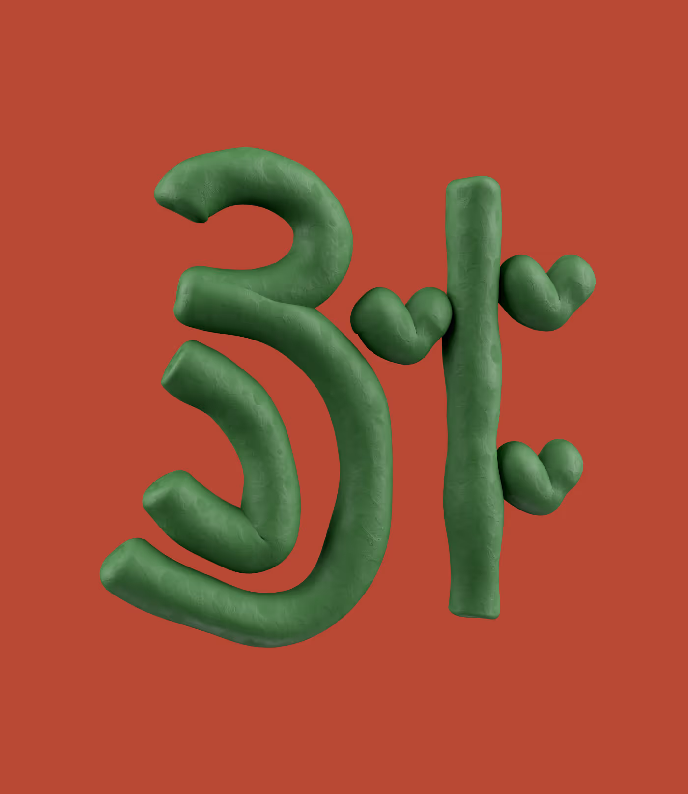
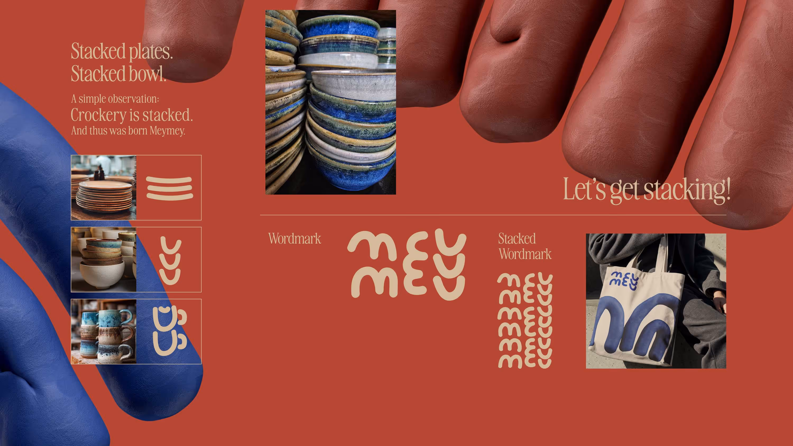
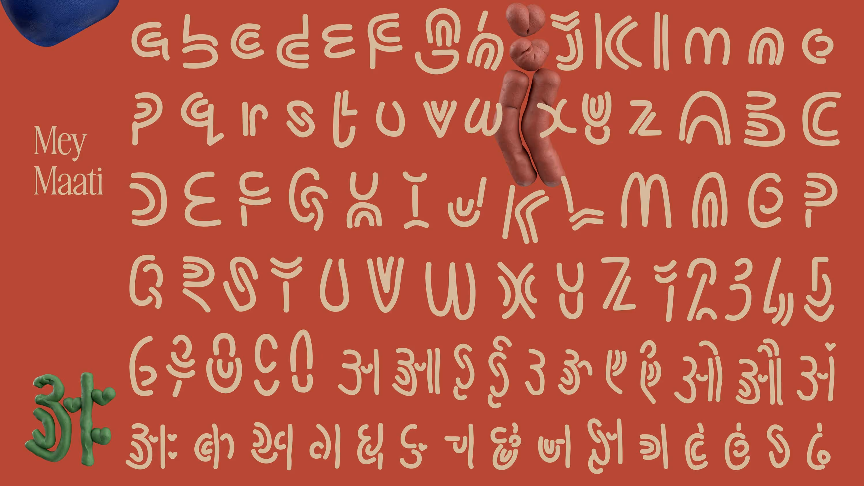
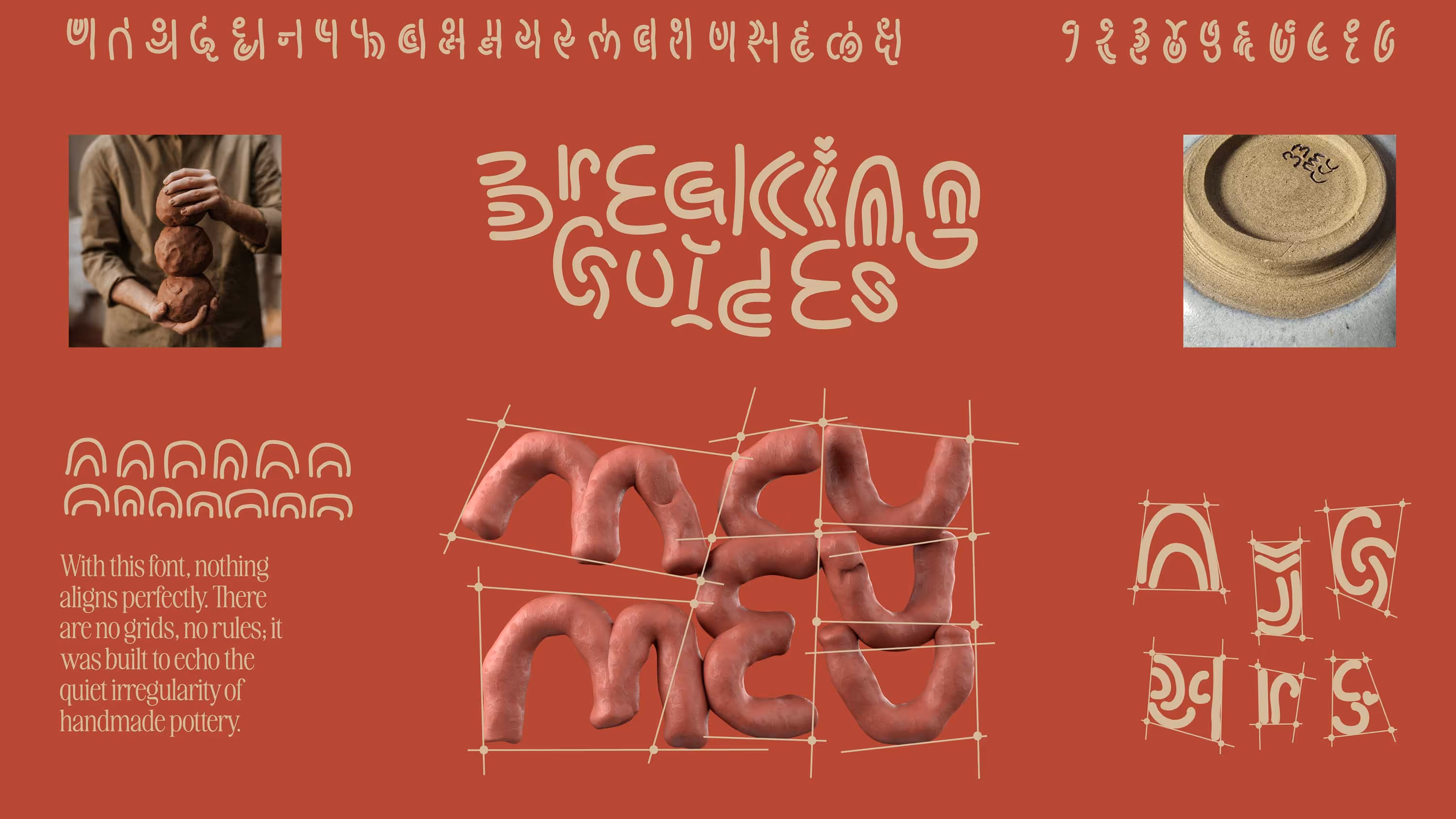
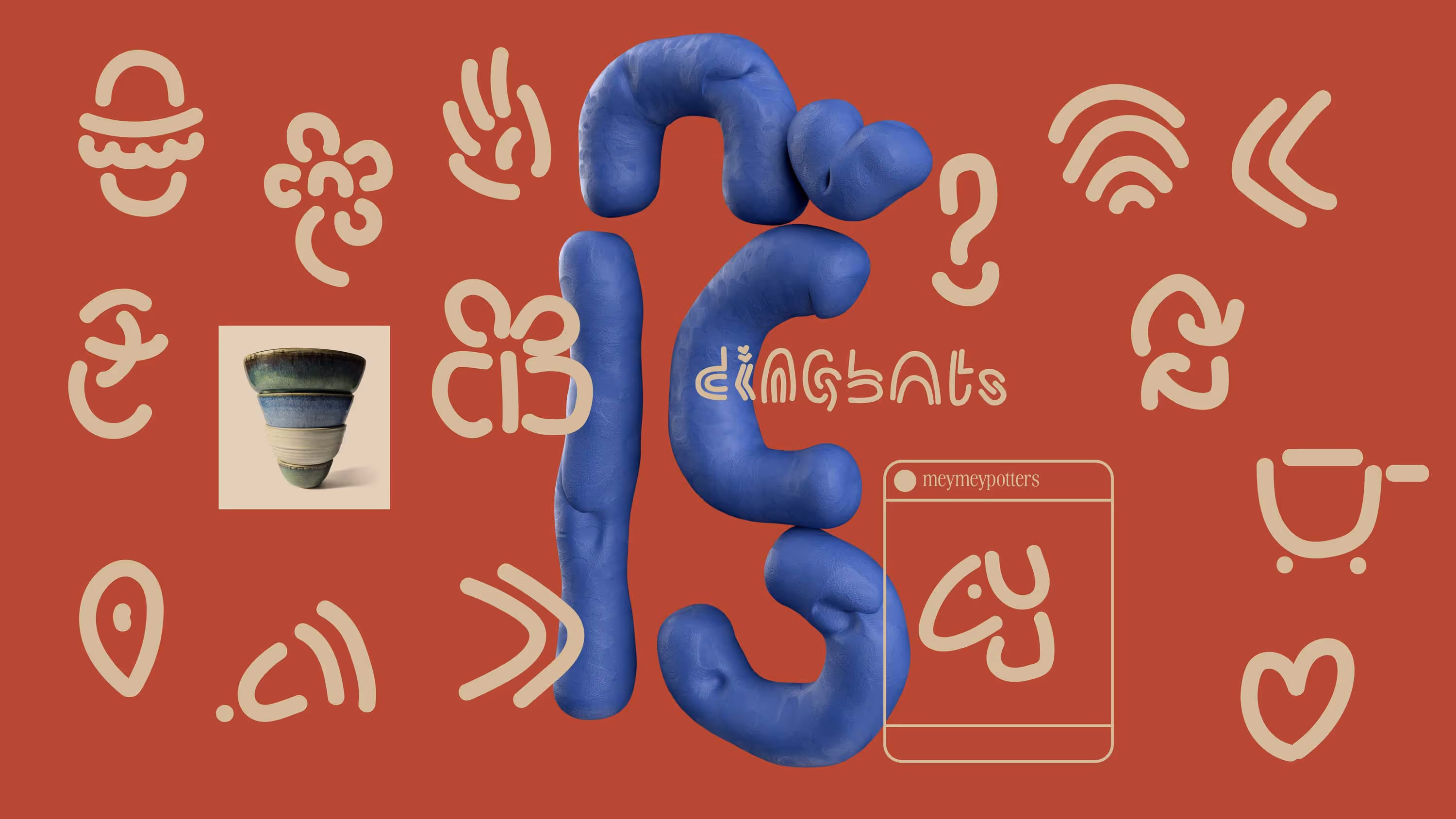
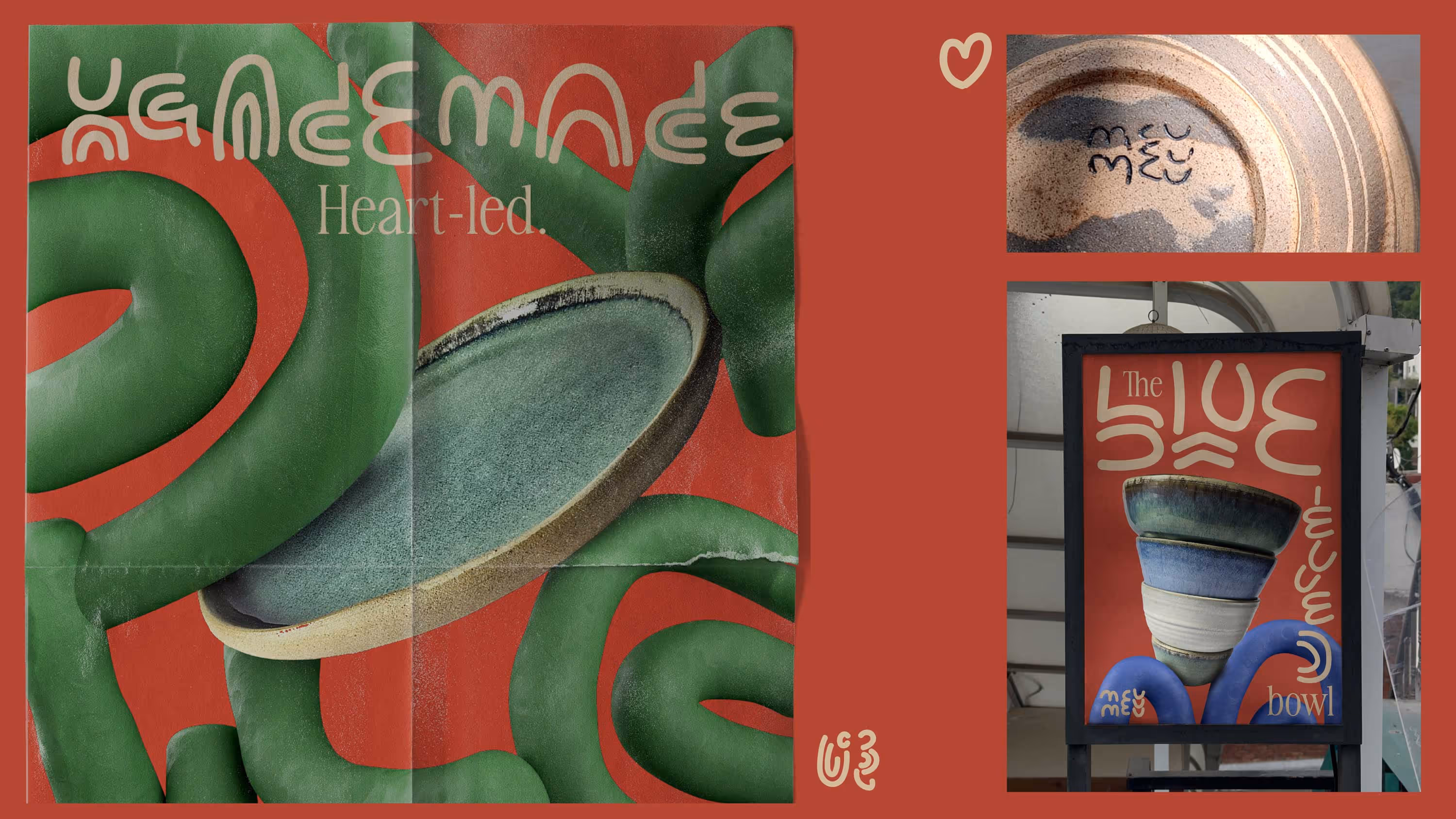
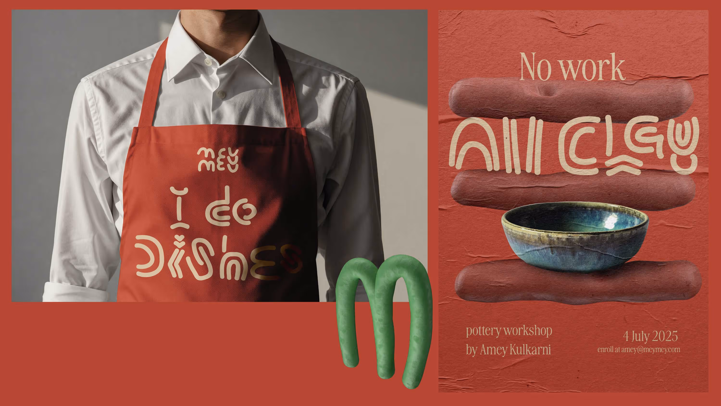
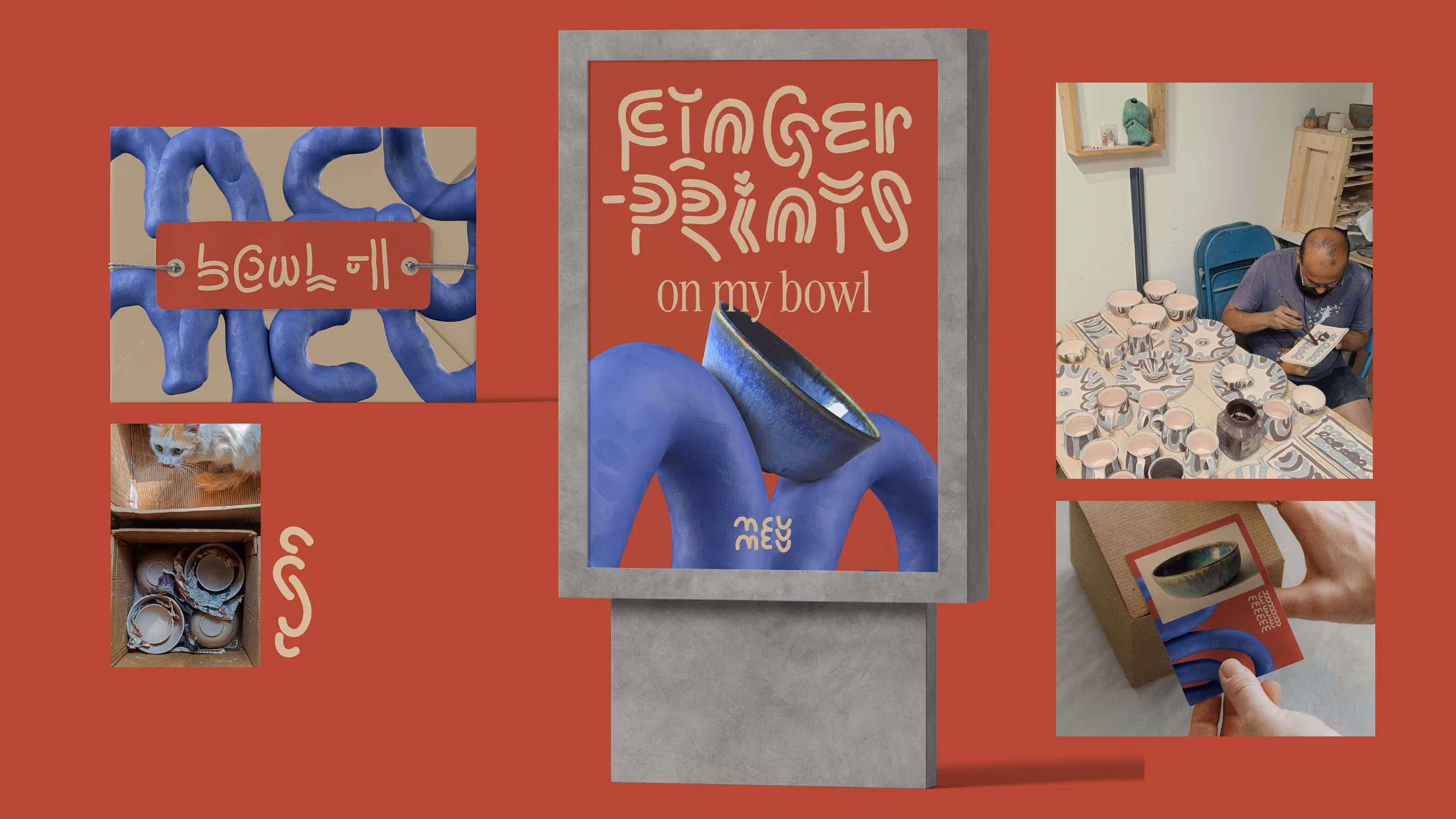
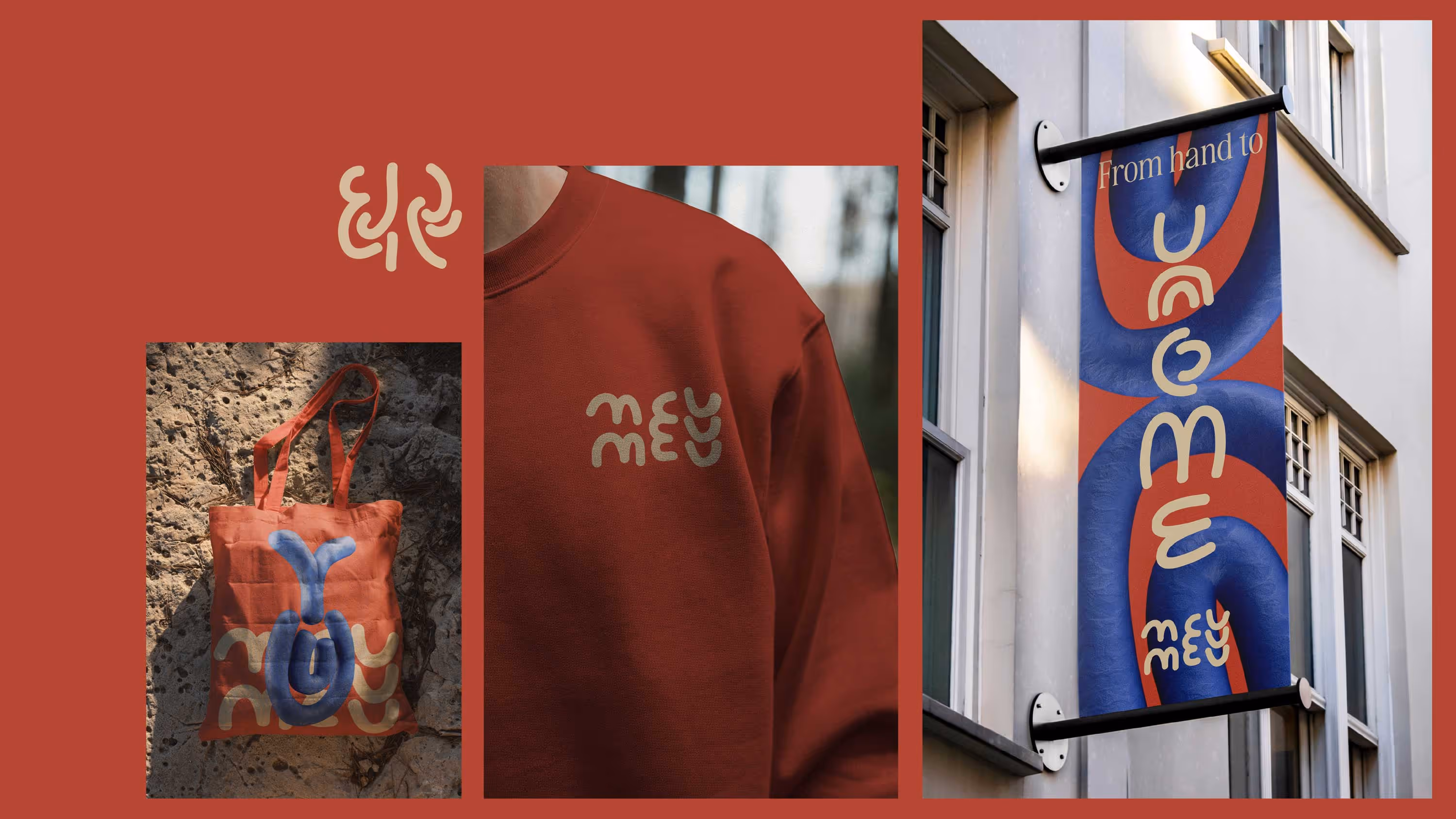
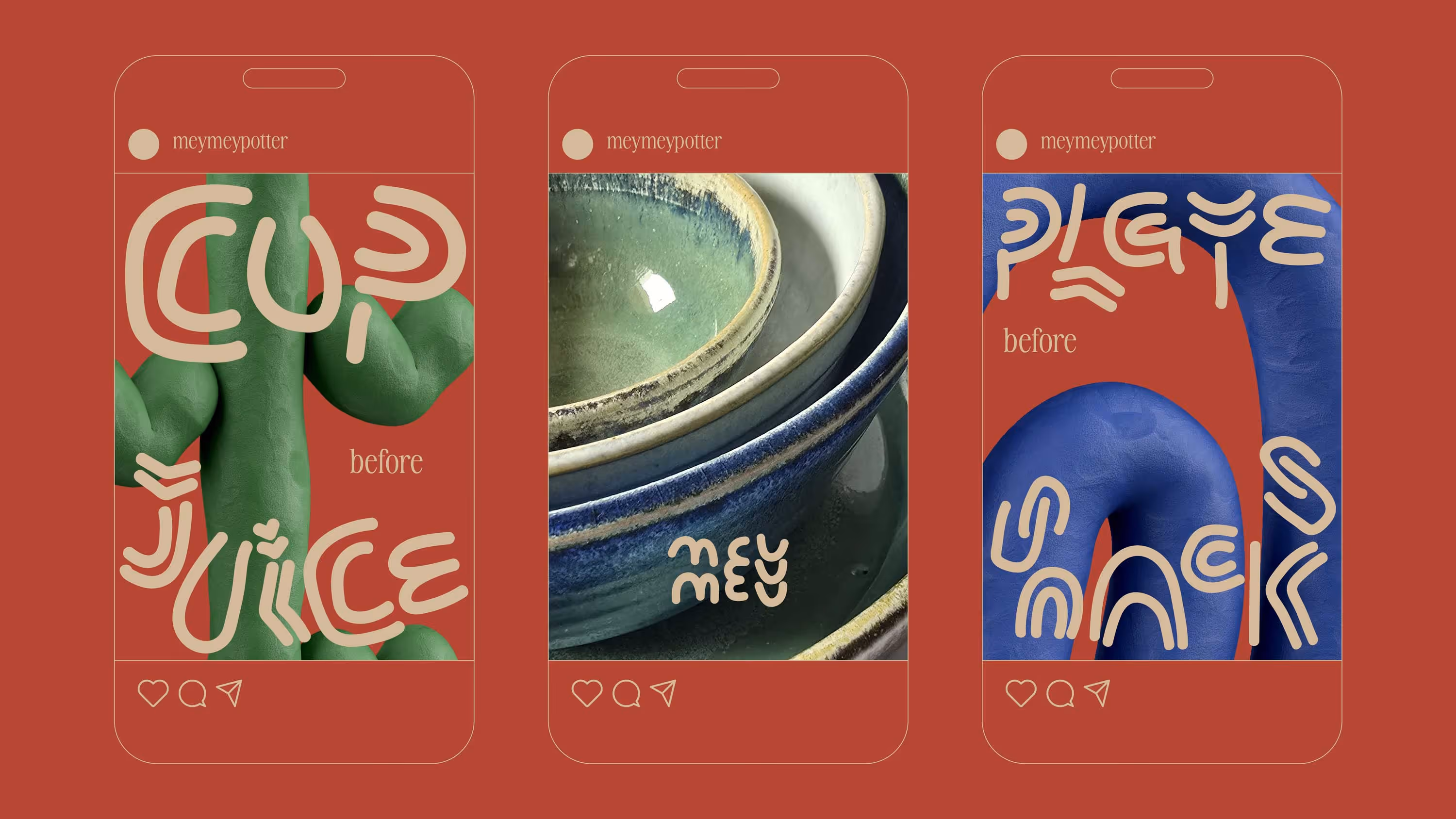
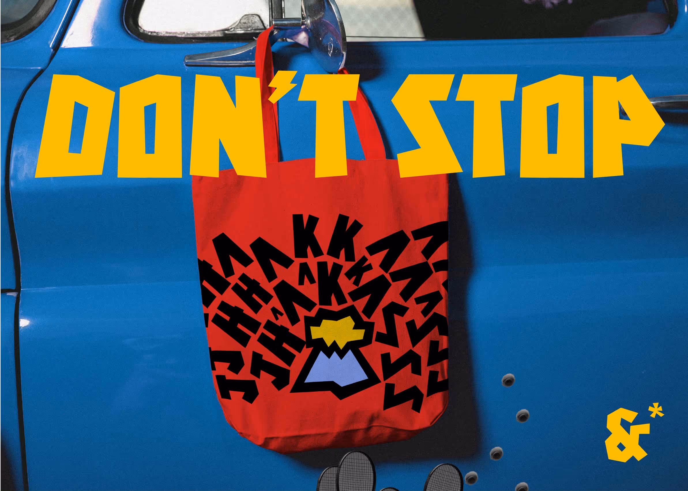
Meymey
Meymey is a newly opened pottery studio that adds handcrafted goodness to ceramics. Building the MeyMey world, didn’t start with an idea. It started with one simple observation: Crockery gets stacked.
Plates on plates. Bowls inside bowls.
From stores to shelves, homes to help, everyone, everywhere stacked.
This observation turned into an idea. And that idea became the spine of the brand. The branding stacked, just like the product.That same stacking led to a bespoke font, MeyMaati, and a suite of 3D letterforms.
From unique letterforms to complementary dingbats, each character echoed the same principle of thoughtful assembly. Every kerning and leading choice reflected the clay's raw, tangible nature.The font looked like a family not because it was built on a grid, but because it broke it. The entire typography system was designed to nod to the slight, beautiful inconsistencies found in handmade pottery. Alphabets, numbers and dingbats together shaped a world that felt distinctly MeyMey.
Stacking, an almost invisible category behaviour, was turned into an identity. And a typography world was built around it.
Branding & Typeface Design
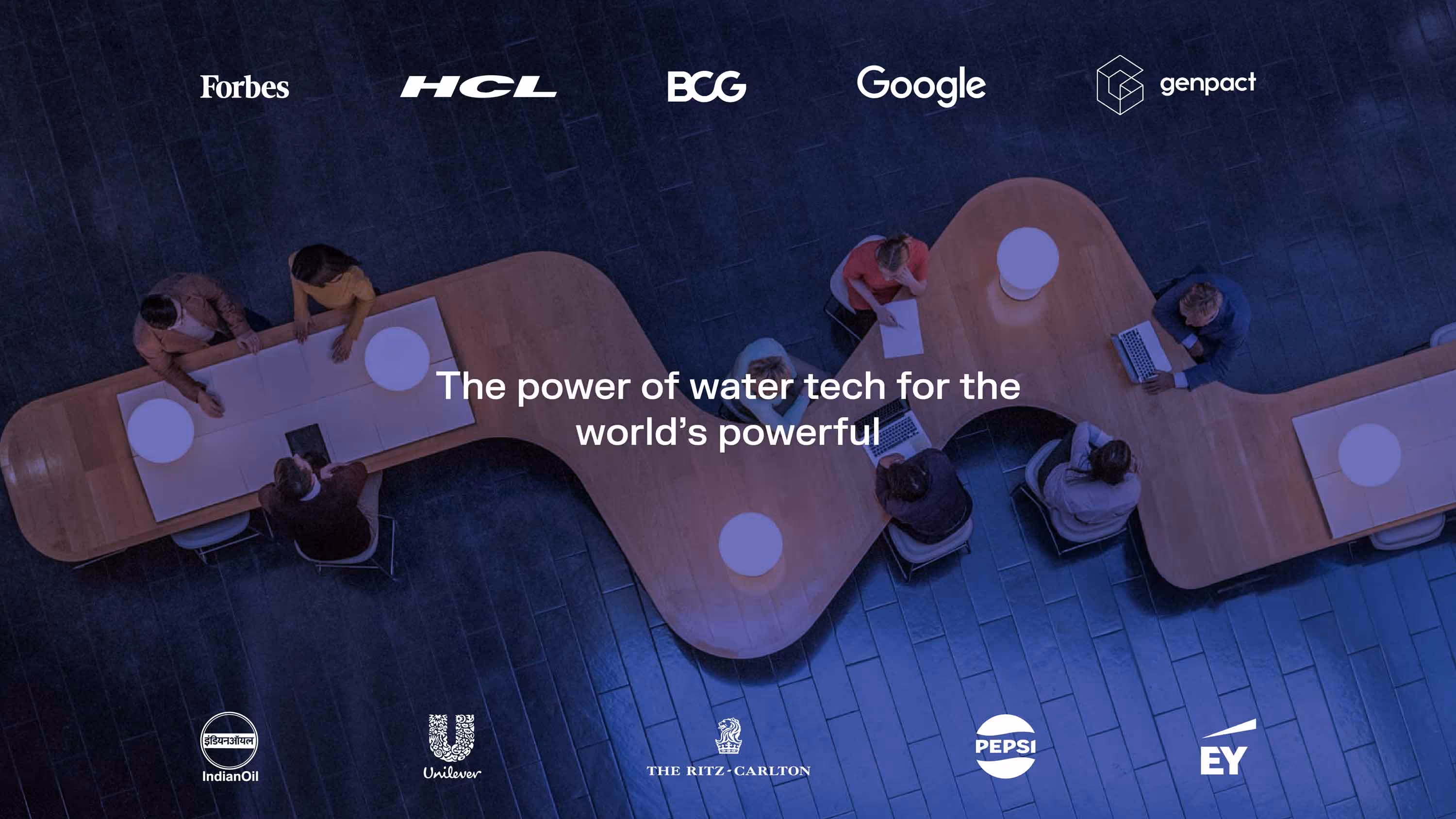
Boon
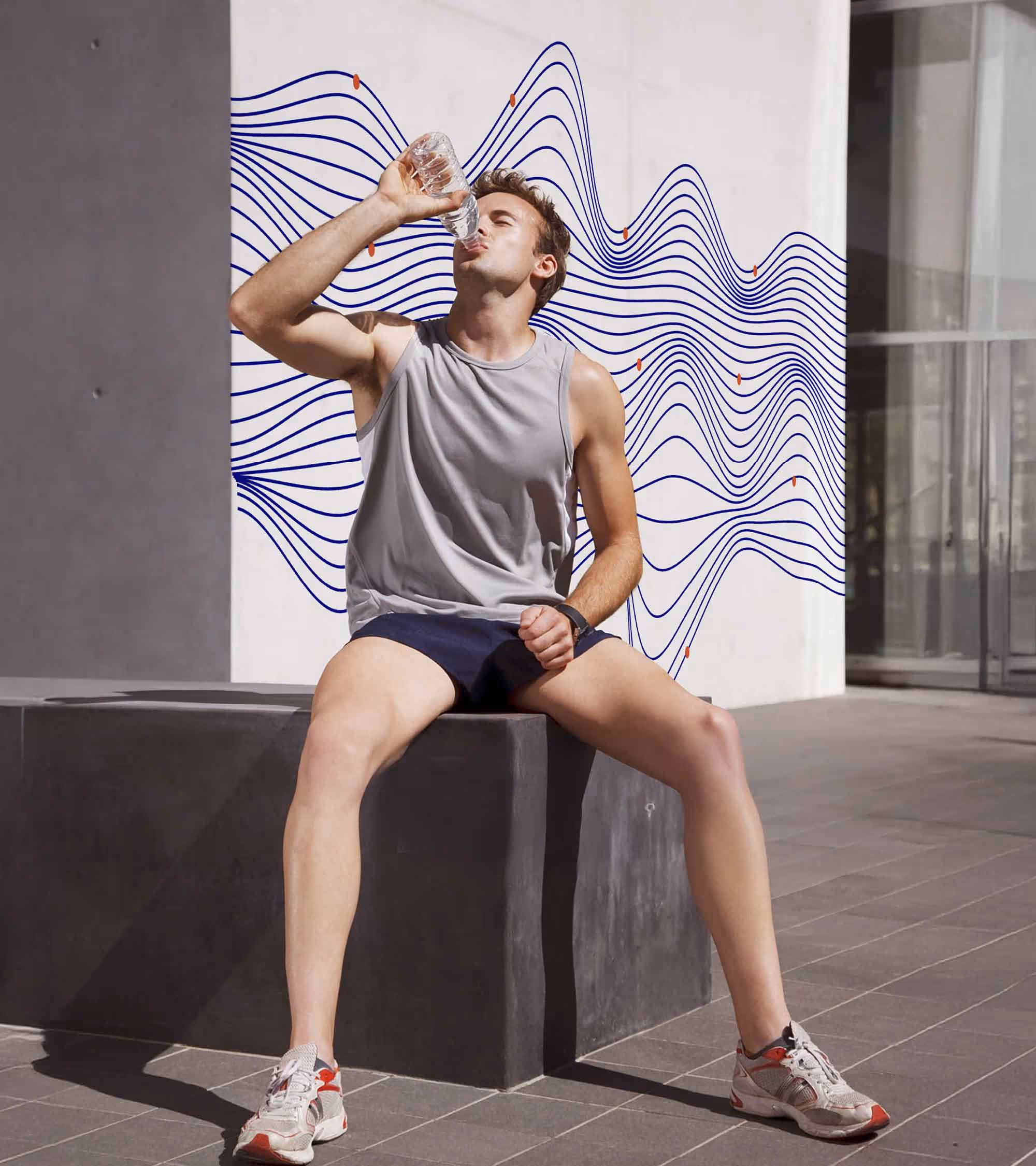
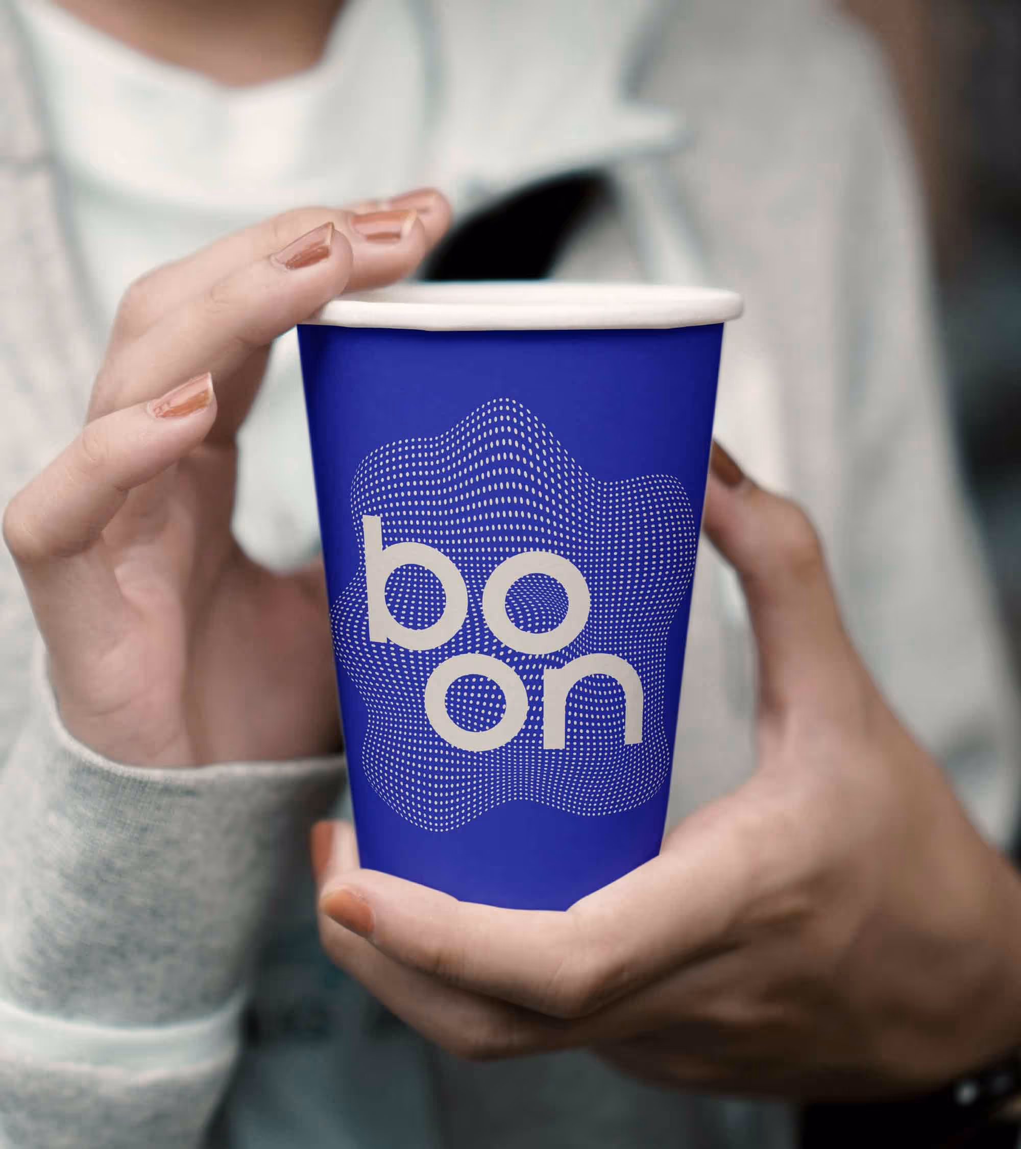
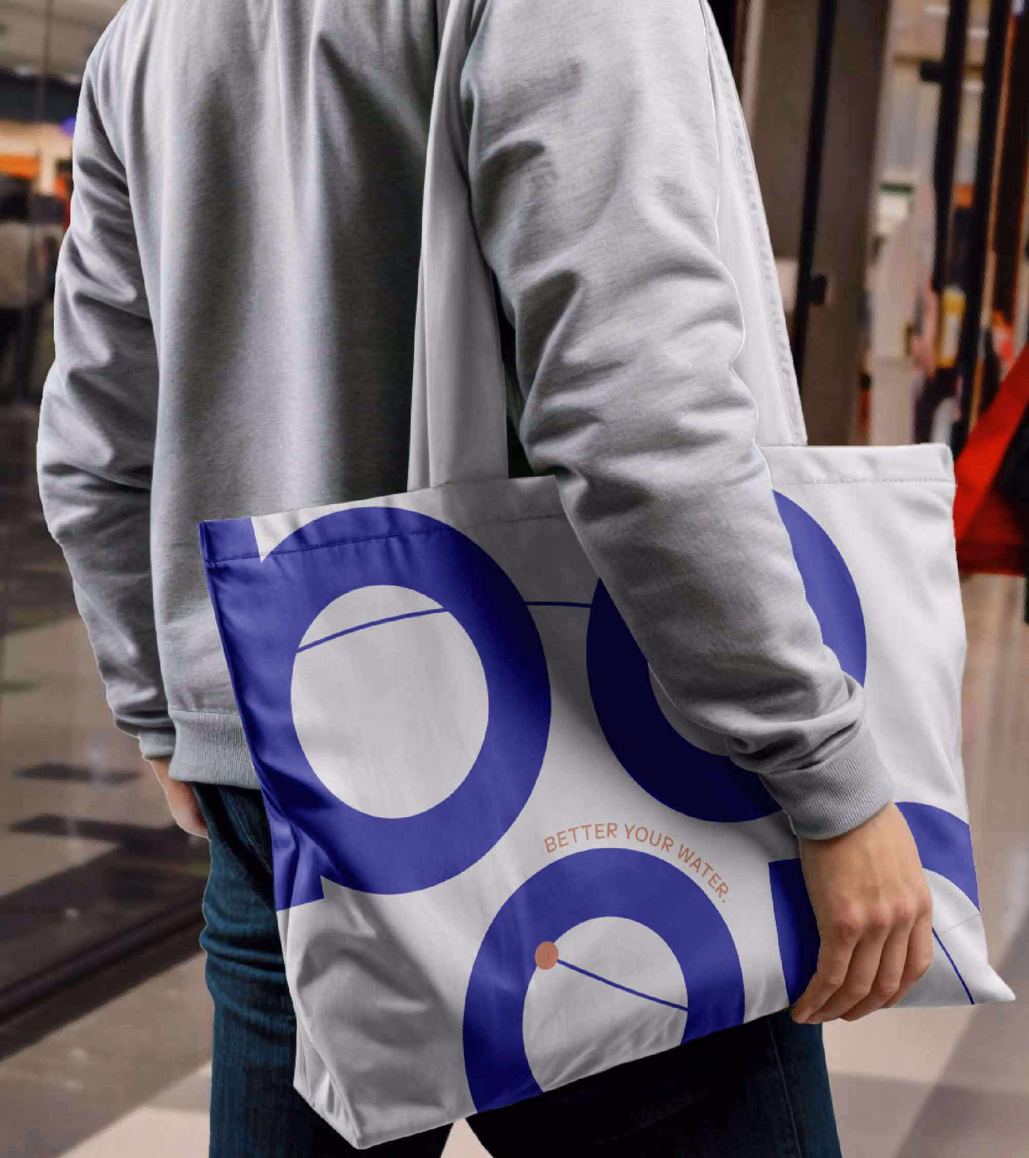
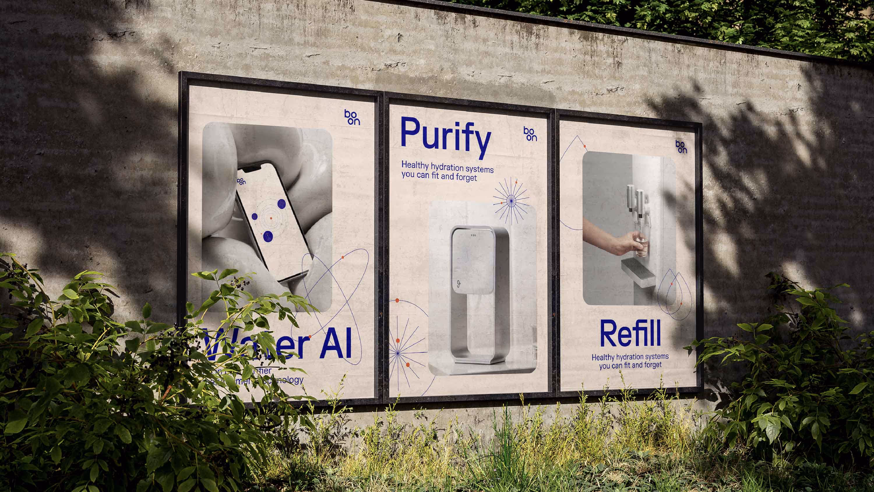
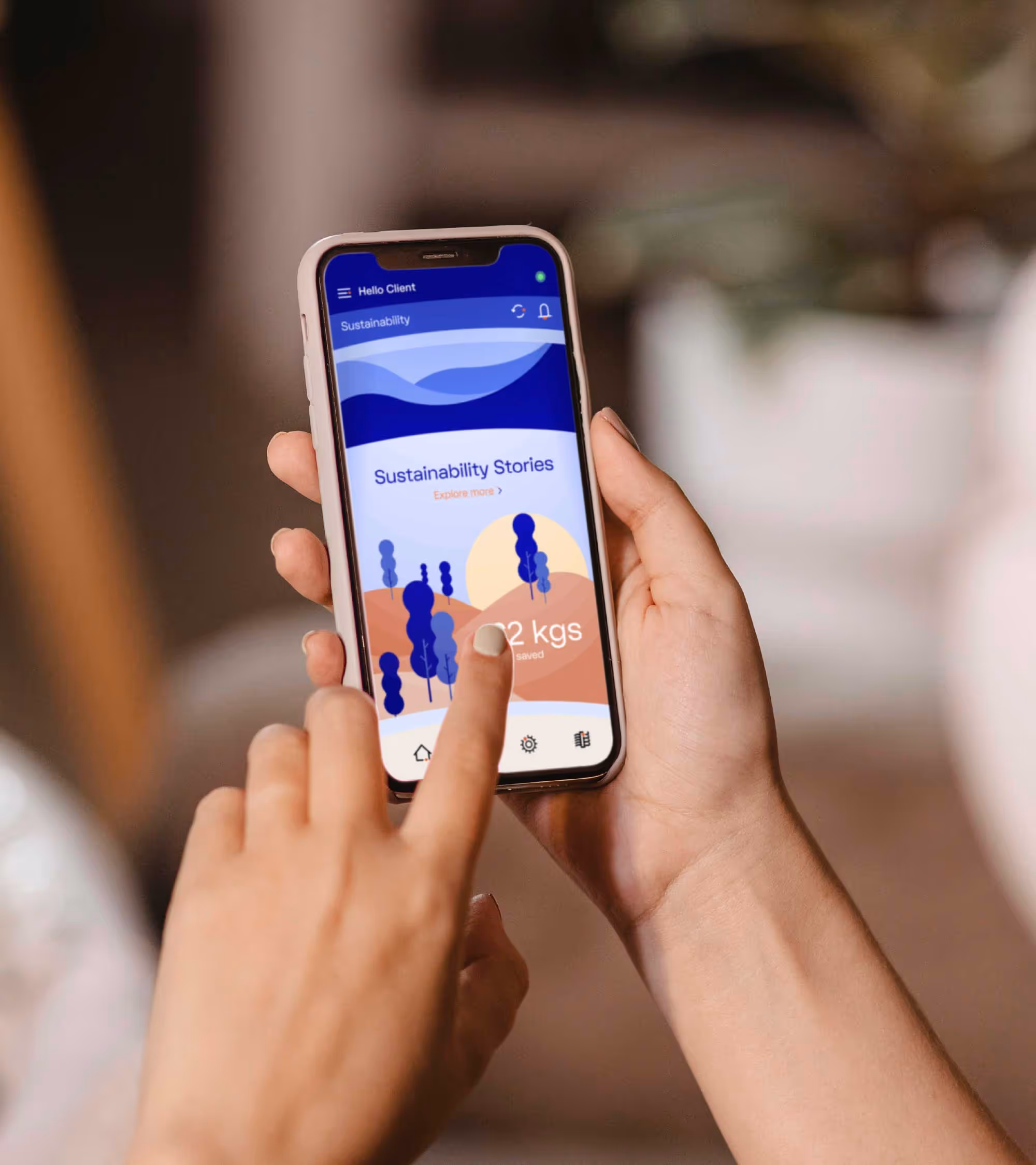
Boon, the water-tech startup, has been committed to providing clean drinking water to millions of Indians.
Transformative but deeply rooted, Boon needed an identity energetic and aspirational, like clean water itself. Dots symbolize the inception of life. These dots connected through a network of lines that stood for the power of flowing water gave birth to a unique design system for Boon.
Orange for the dots and blue for flowing lines, both drawn from natures’ palette, breathed life into the design. At the core of this identity was born a logo from the synergy of water and life, forming a cohesive design system.
A functional typographic design language, firmly rooted in the design DNA, ensured its adaptability across various brand touchpoints. Everything from technically advanced machines to reusable glass bottles effortlessly sported the key elements of the Boon design system.
Boon—a name that now embodies the very essence of clean, life-giving water now has a brand identity that reflects its transformative mission - connecting water and the world.
Naming, Rebranding, System Design, UI & UX
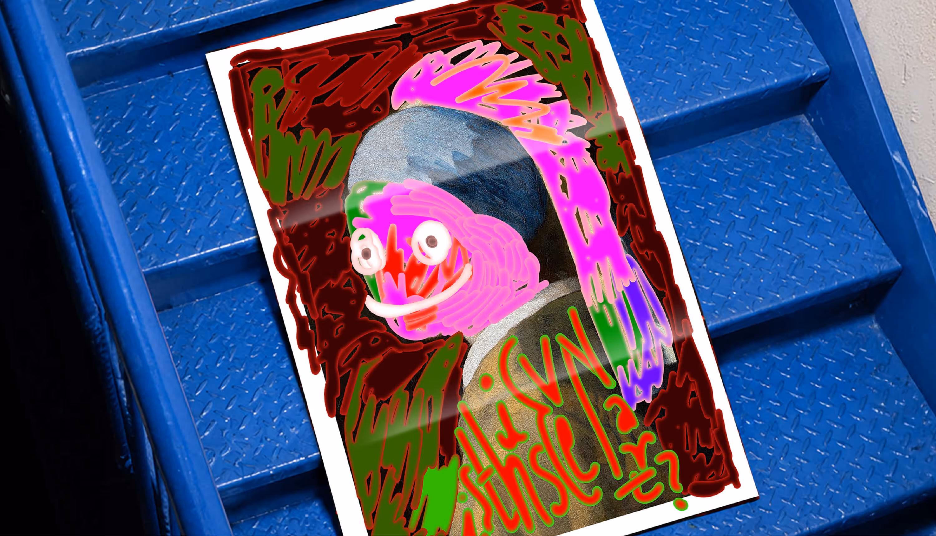
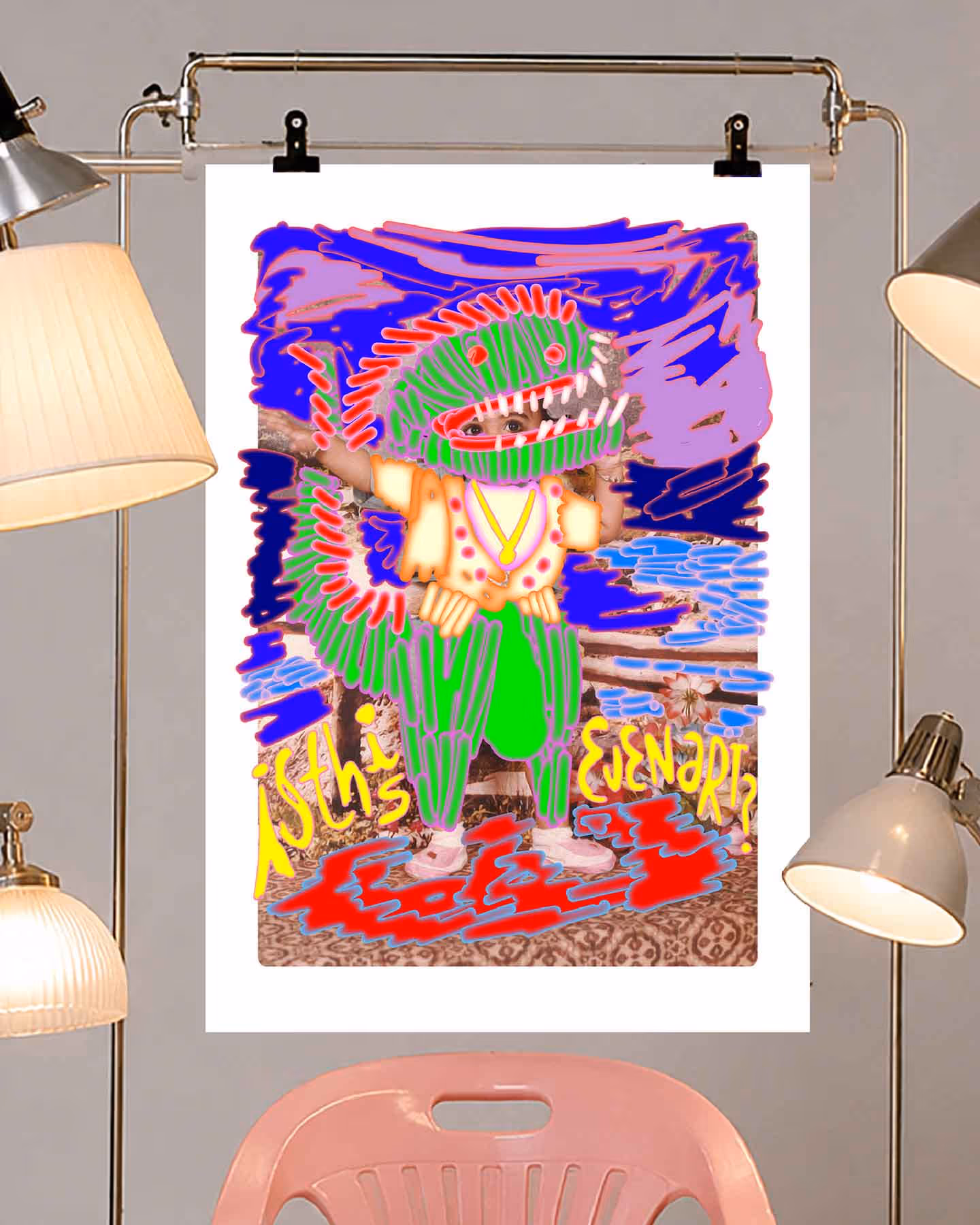
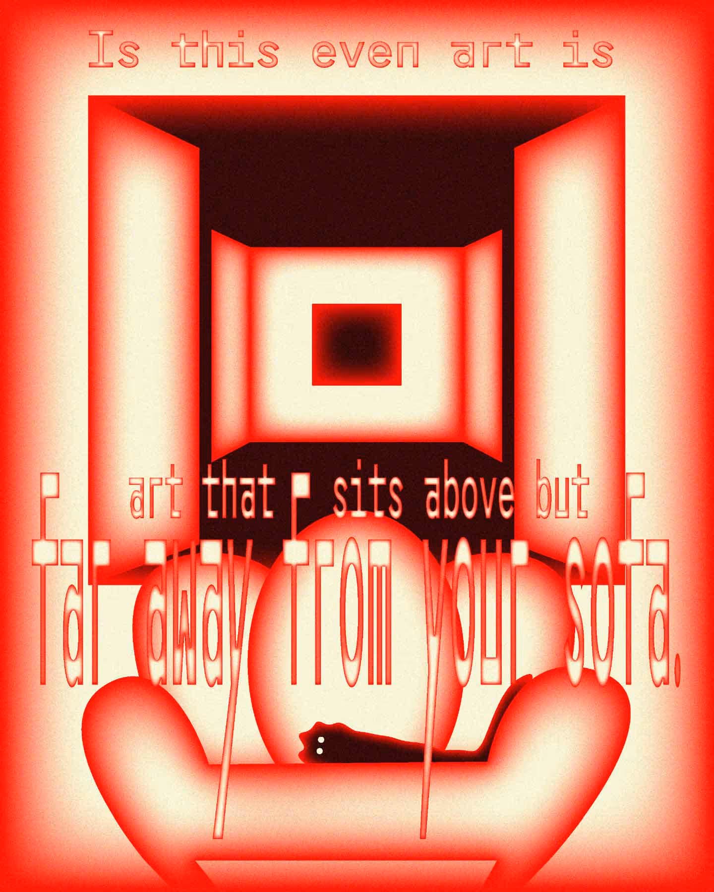
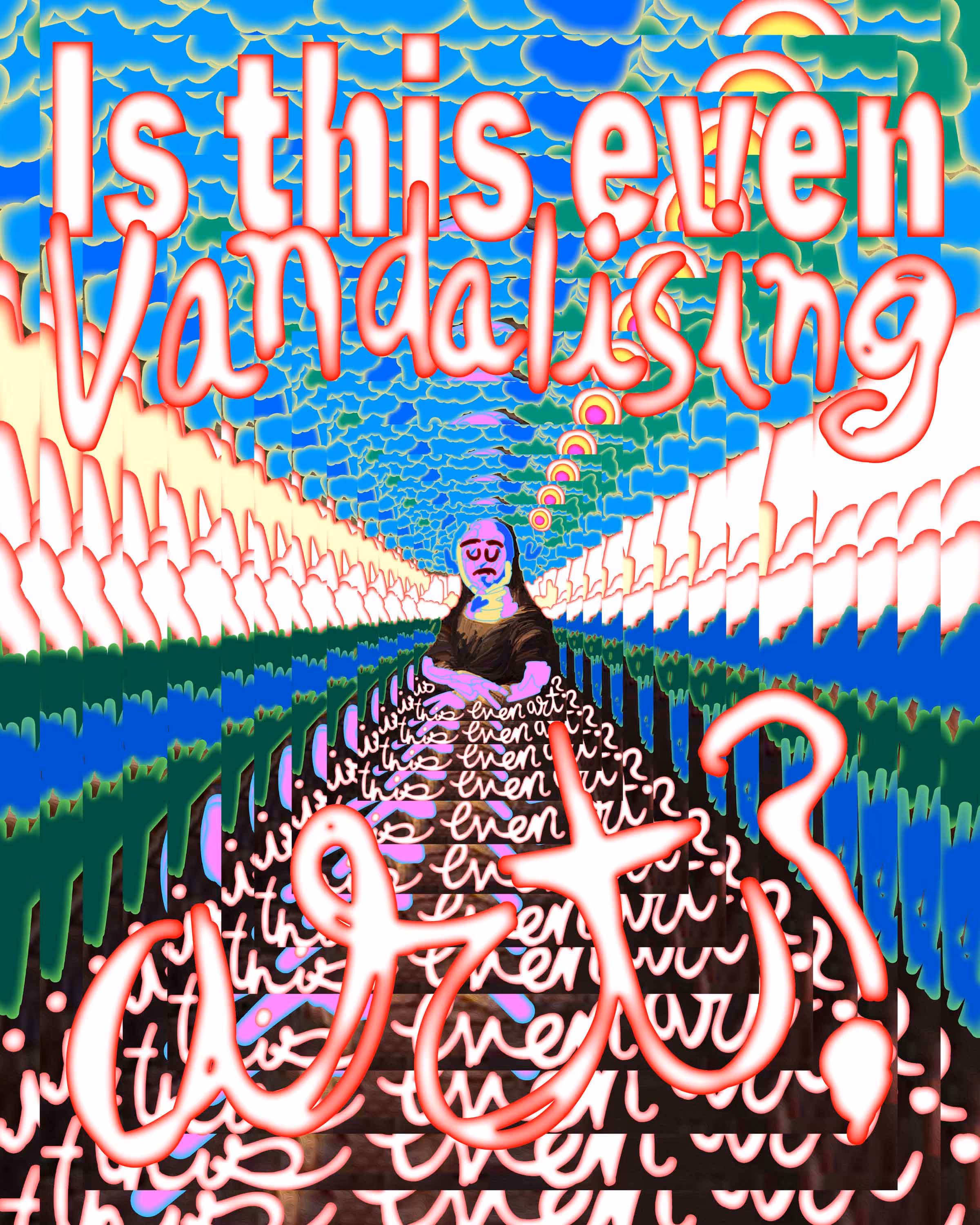
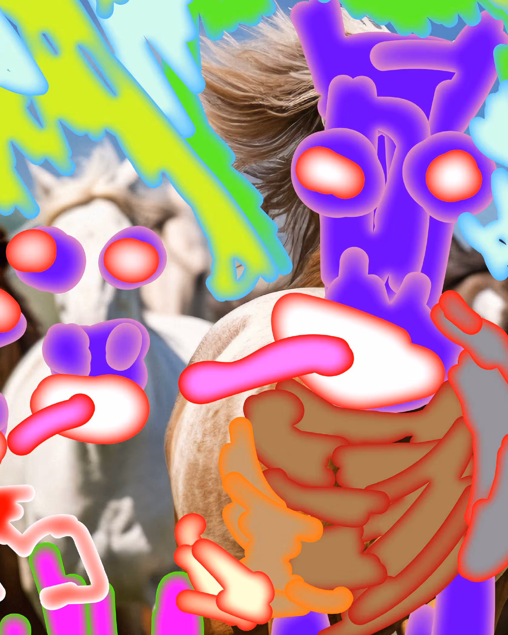
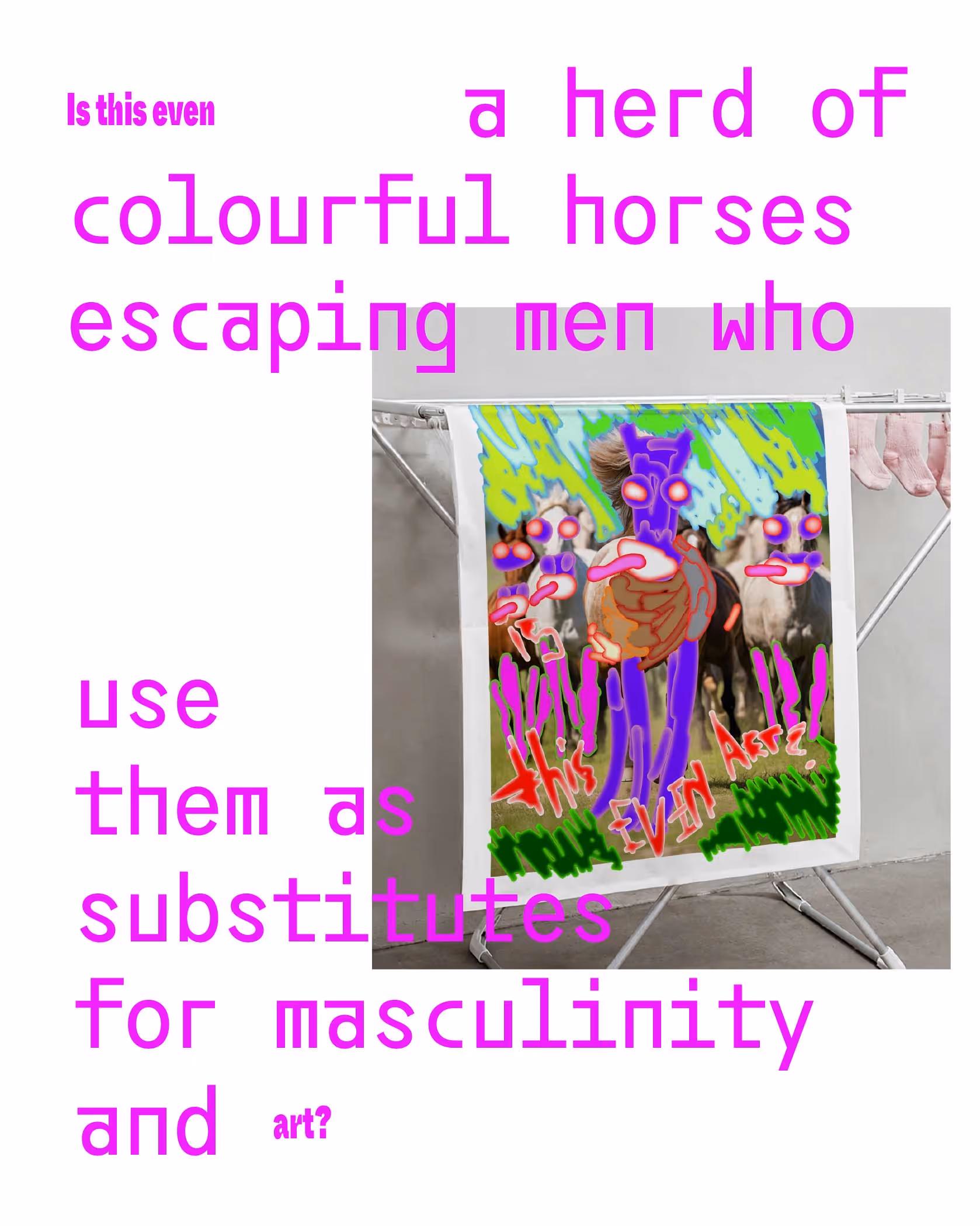
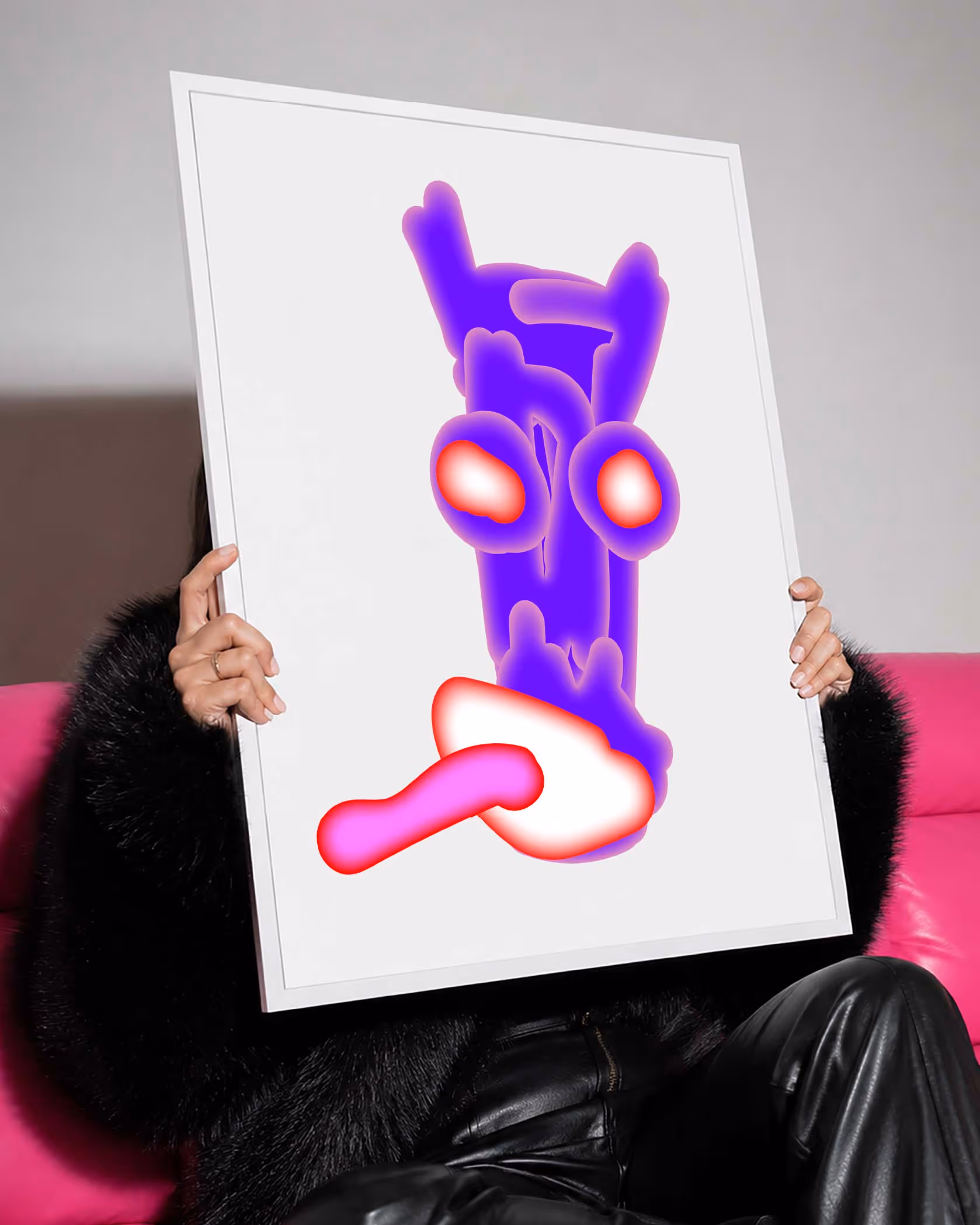
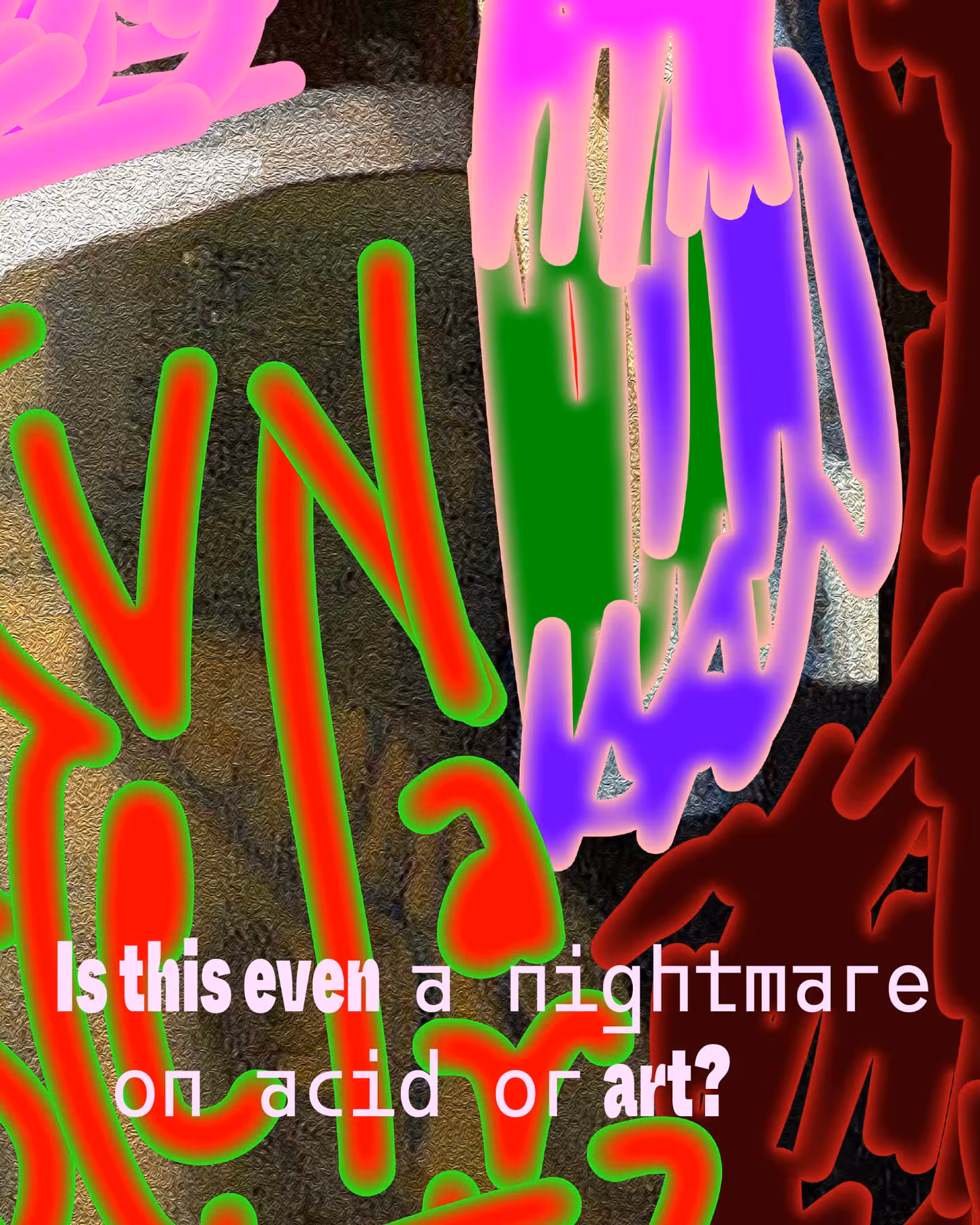
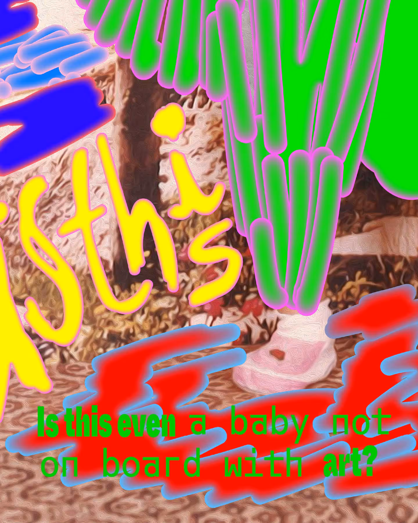
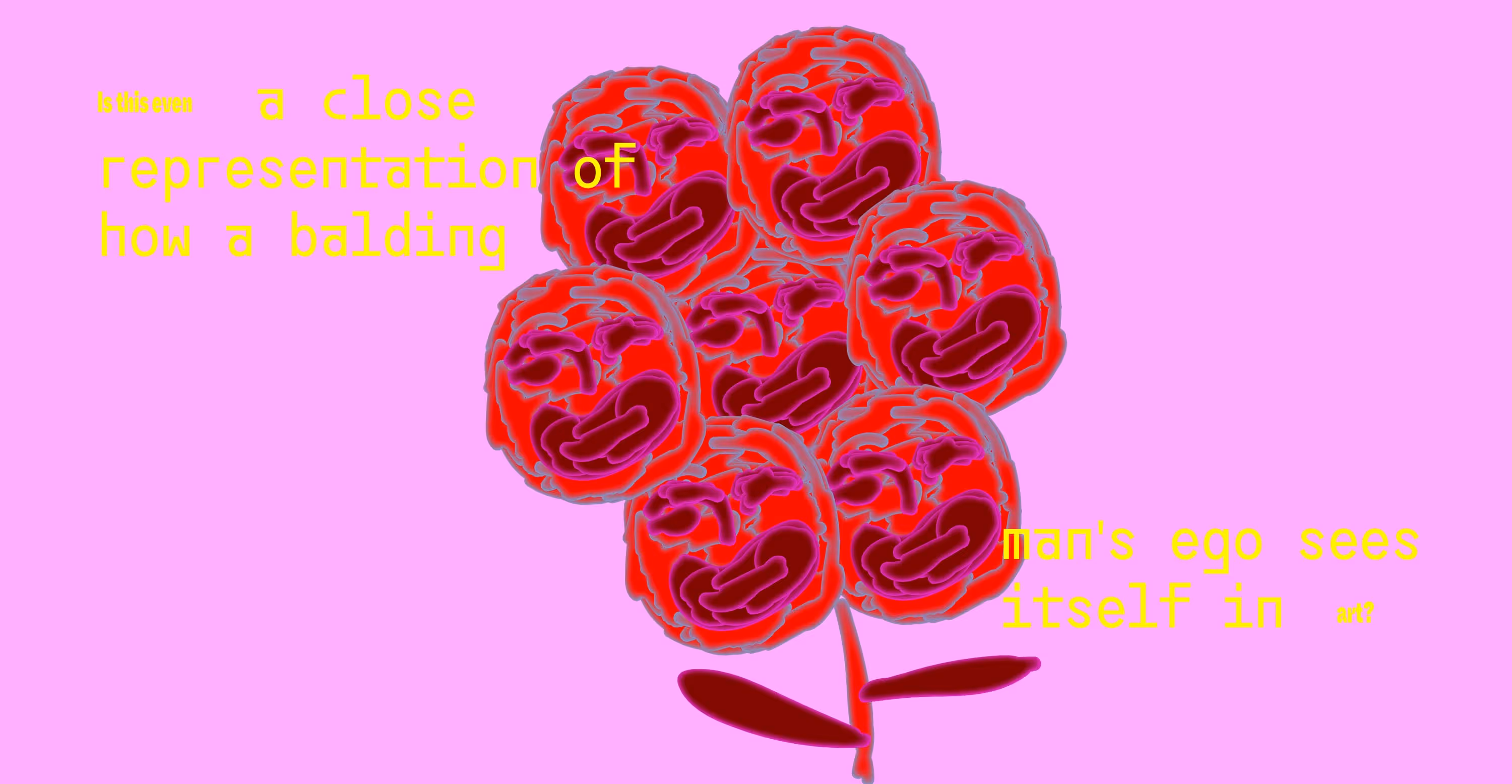
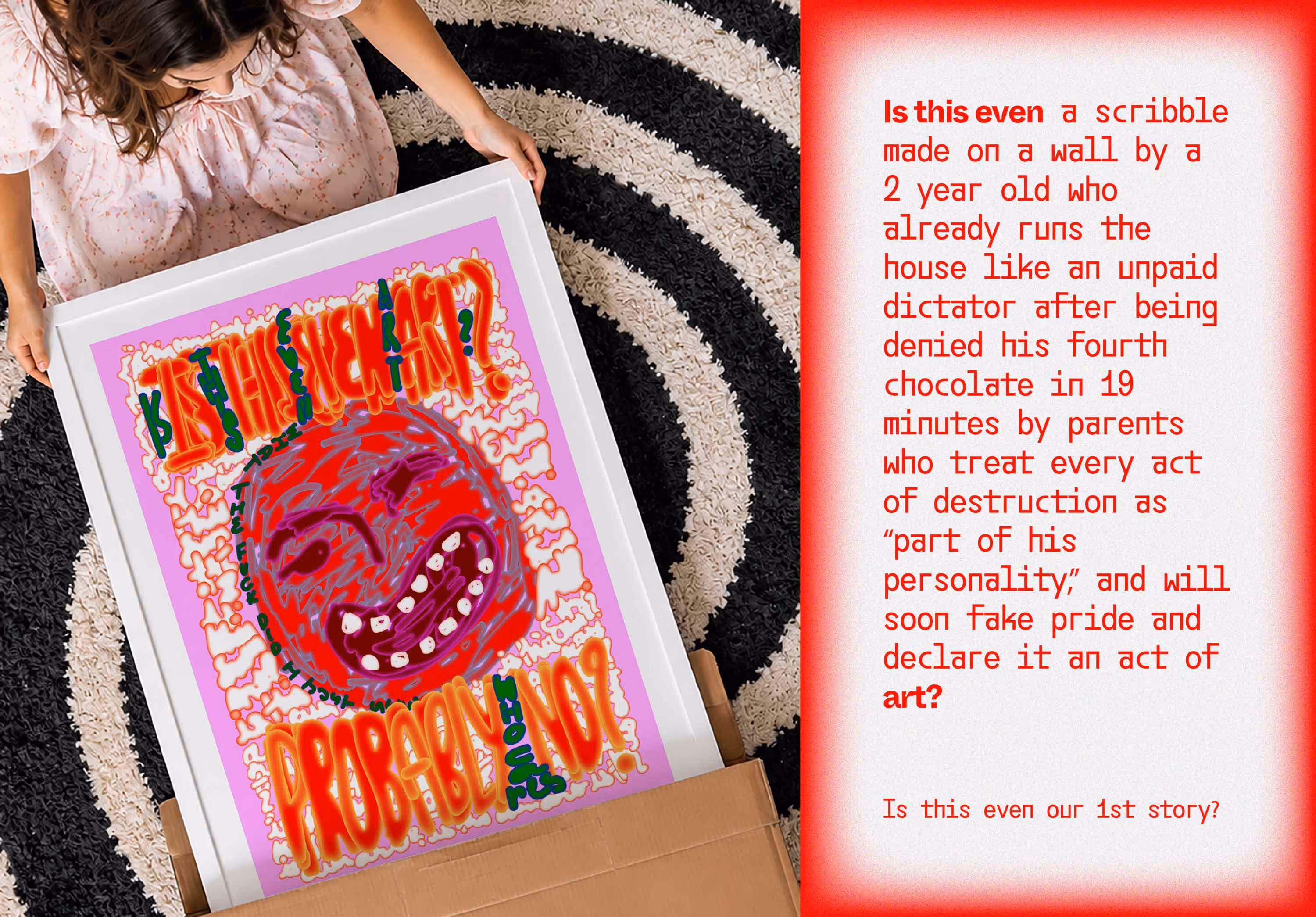
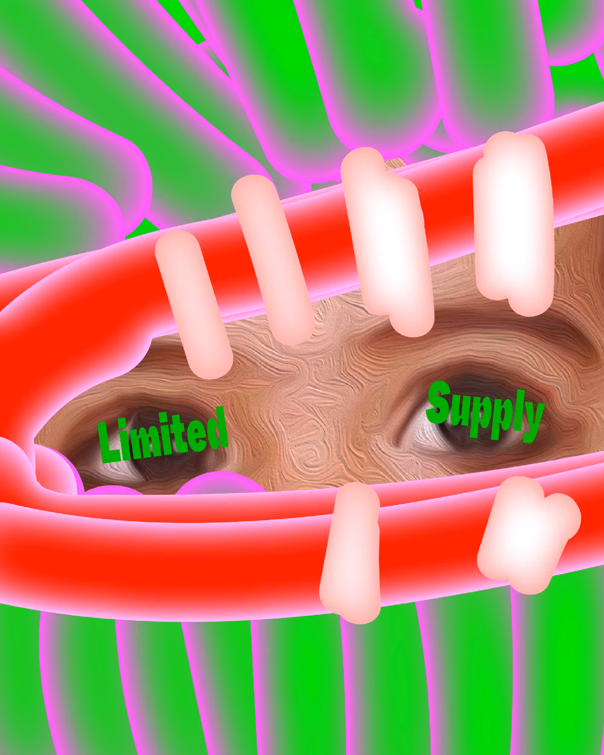
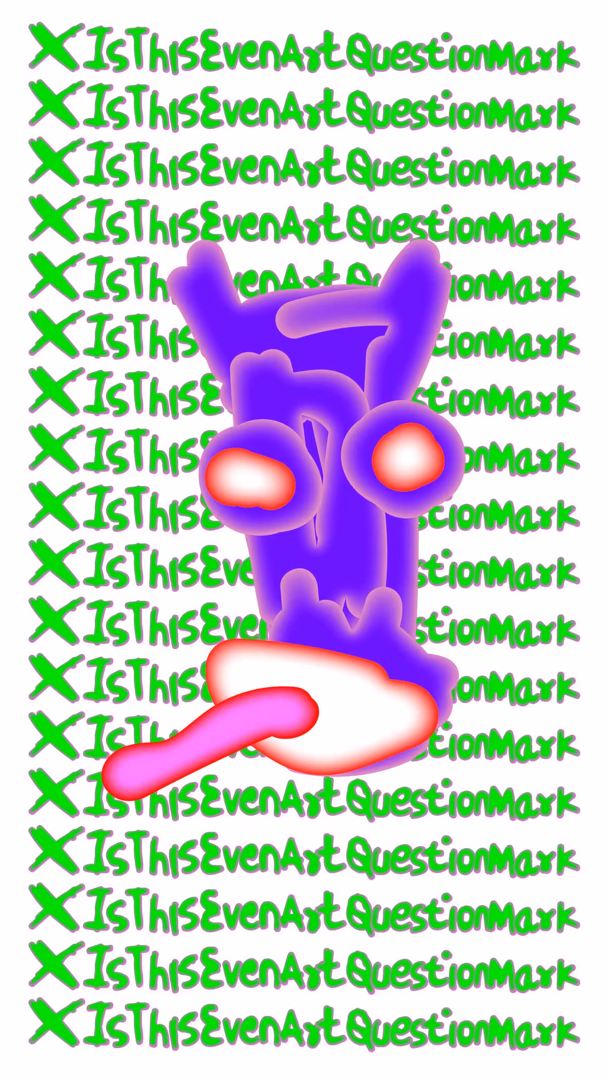
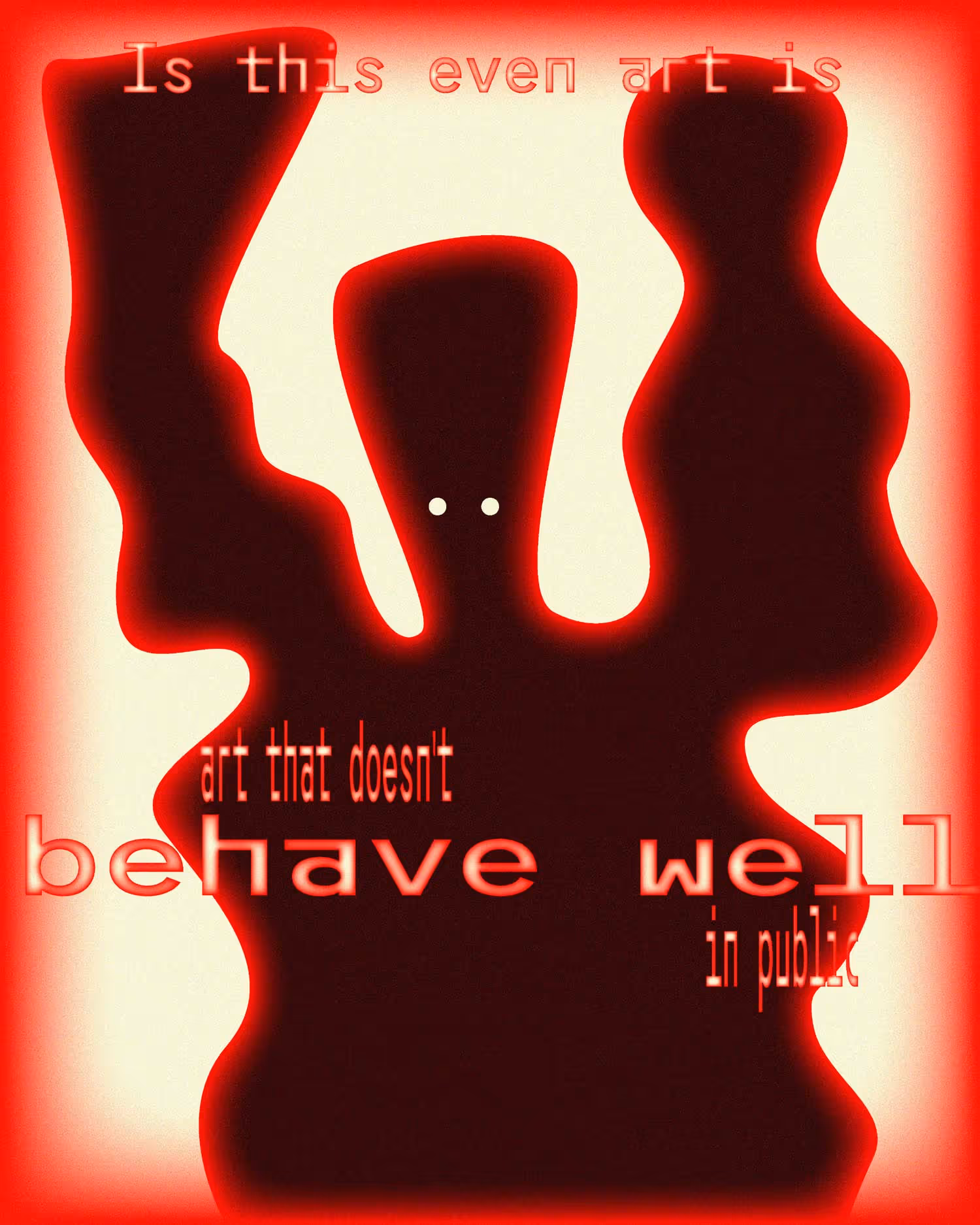
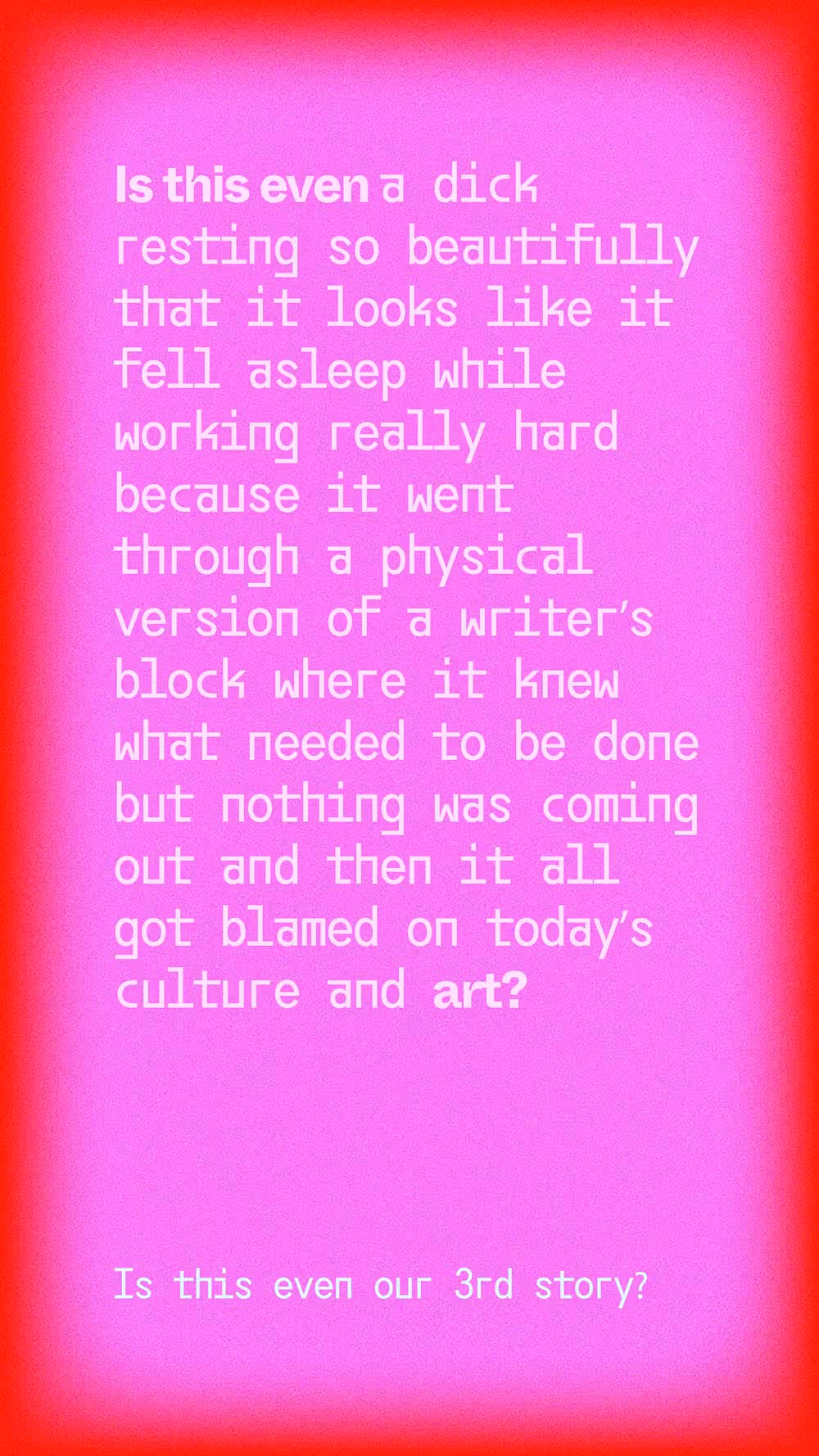
Is this even art?
Is This Even Art? is a creative imprint and retail venture by Moshimbo. It's a digital store, a physical space and an ongoing argument, all under one roof, producing and selling original art objects, limited-edition prints, furniture, installations and collectibles.
The work is united by a single editorial position: anti-boring.
Is This Even Art? exists to challenge the visual sameness that dominates design, décor and the broader art market. It's art that sits above, but far away from, your sofa.
The project was born after years of making the world look better for other people. At some point, that gets to you. So we locked ourselves in the smallest room and started making things purely because we wanted to. No briefs. No clients. No apologies.
Naming, Branding, Product & System Design
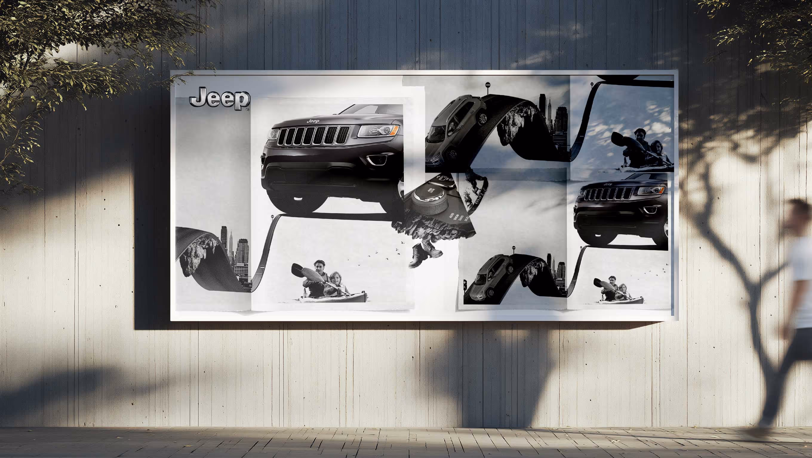
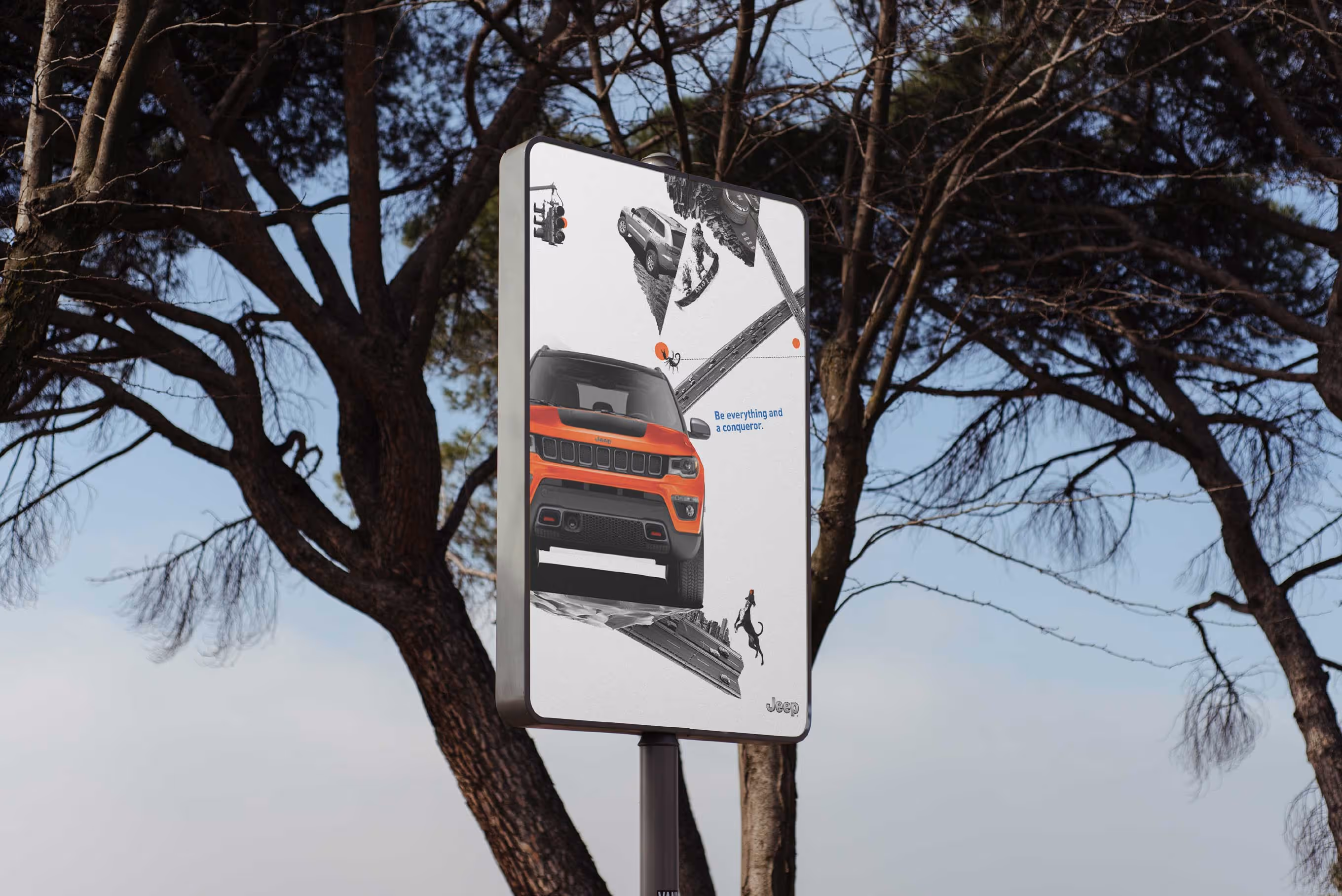
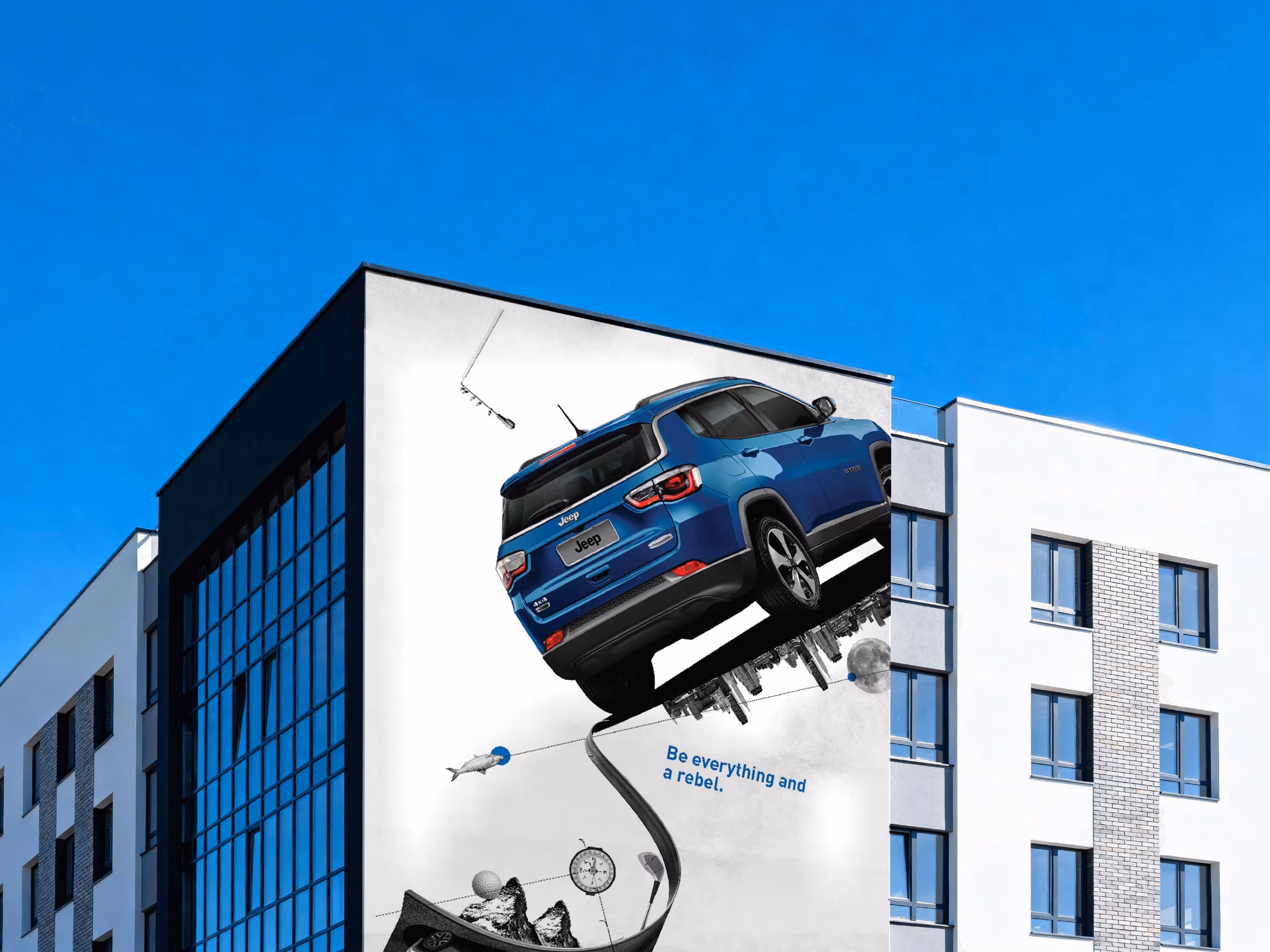
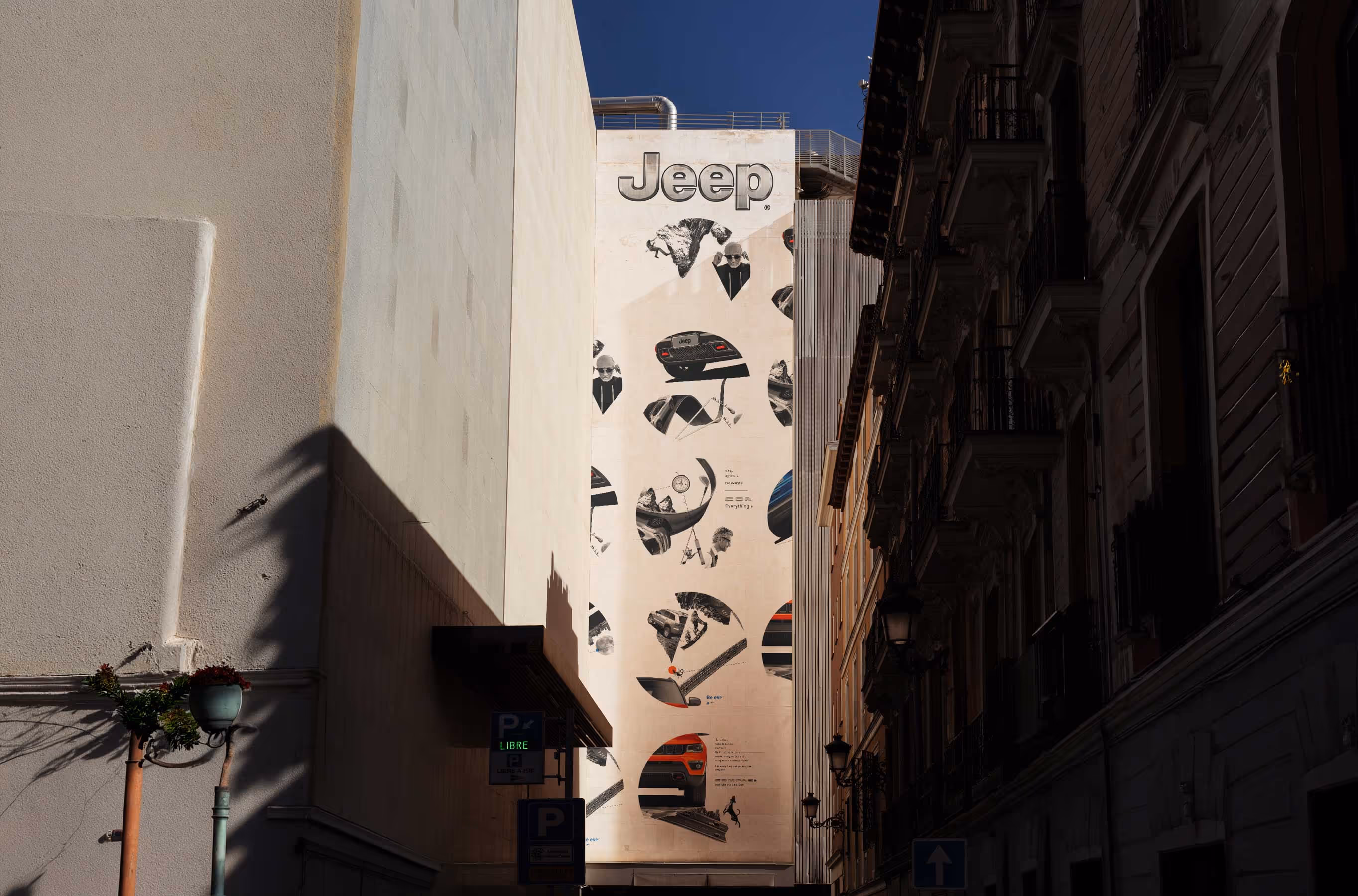
Jeep
For most SUVs, freedom is usually communicated through mountain roads, muddy tyres and the occasional person standing on a cliff. Jeep, however, has always stood for something bigger. The freedom to go wherever you want and do whatever you want.
The task was to build a communication language for the Jeep Compass that captured this spirit of limitless possibility and translated it into a distinct visual system.
We worked with the idea that every road can become an adventure and every destination can become a beginning. Familiar objects, landscapes and moments were reimagined as extensions of the Jeep world, creating a visual language where boundaries felt fluid and possibilities felt endless.
The result was a communication system built around exploration, spontaneity and the simple belief that freedom isn't just about where you can go. It's about what you can make possible once you get there.
Design Language & Communication
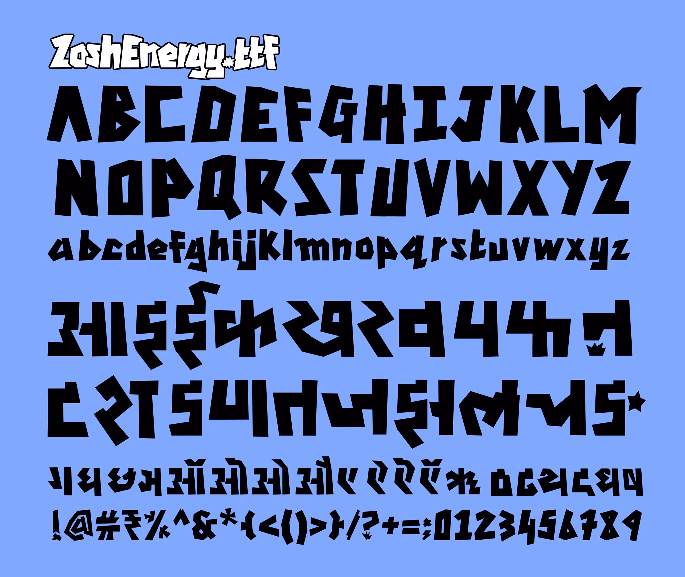
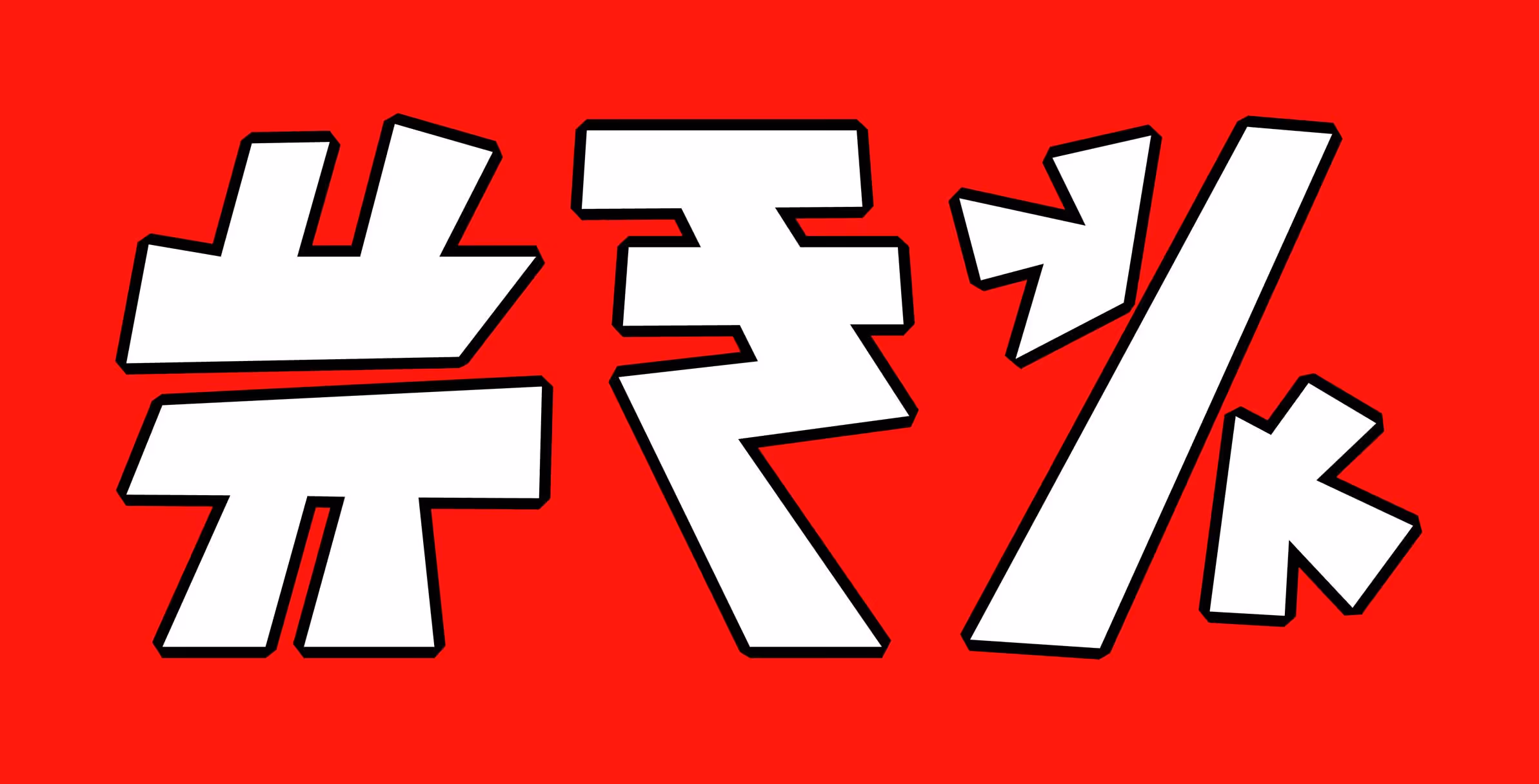
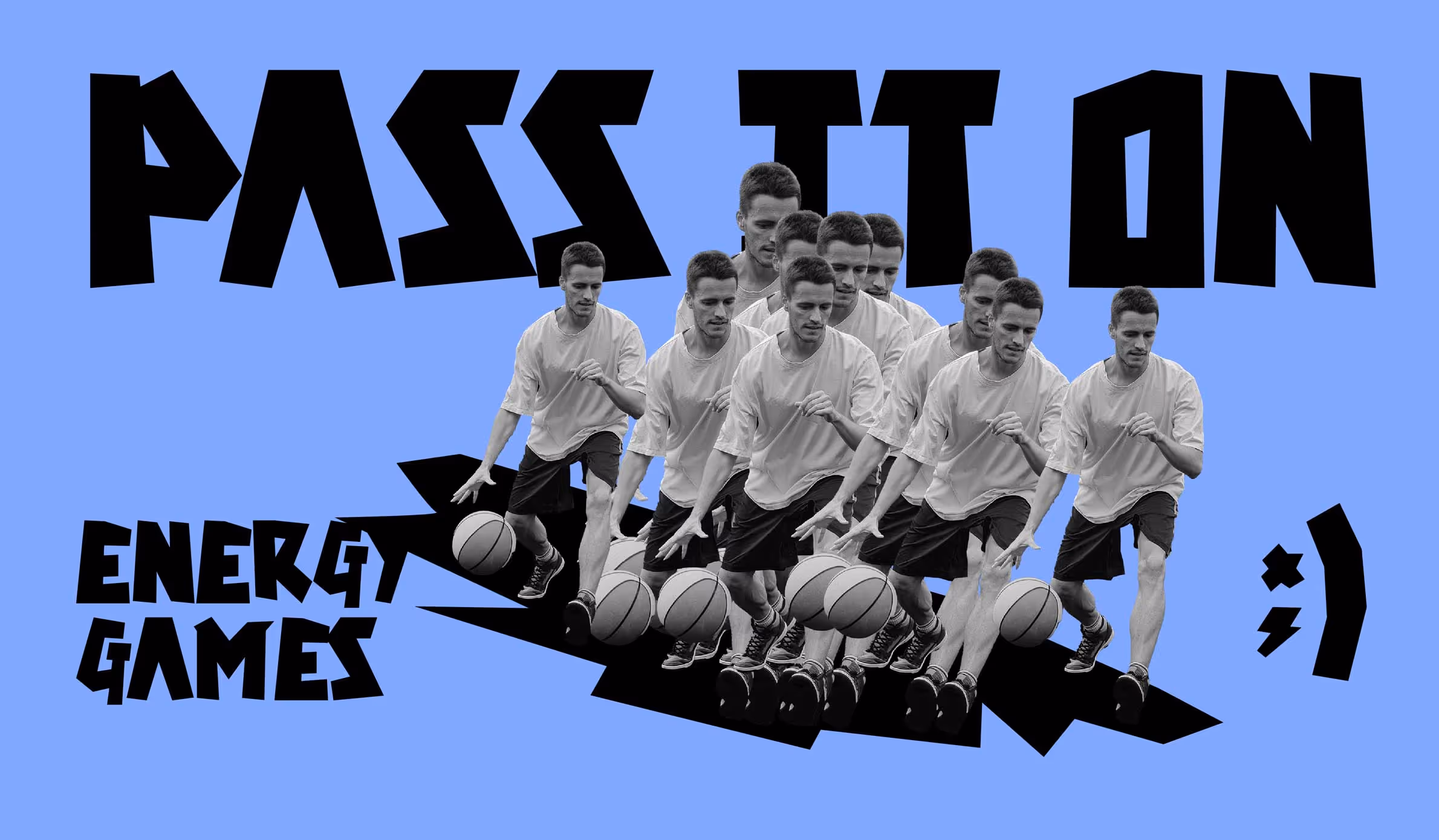
Zosh
Zosh is a 75 ml shot of pure energy with no fizz and no sugar, designed to keep up with the demanding rhythms of life in India. As a category creator, the real challenge was to establish Zosh as a distinct and viable alternative for instant energy. And for that, the brand didn't just need a unique identity that would work on the crowded and competitive shelves of the Indian marketplace, it needed an instantly recognisable brand asset.
Typography represents a brand's visual voice. It accounts for 85% of brand visibility, influencing communication and perception. Inspired by the dynamic pulse of life in India, where one has to navigate bustling streets, meet tight deadlines, and move from early morning routines to late-night commitments, we created a custom multi-script typeface family, Zoshenergy.otf. It comes to life through a typographical design system born from the product itself, exuding energy that is strong, packed and built for performance.
Typography represents a brand's visual voice. It accounts for 85% of brand visibility, influencing communication and perception. Inspired by the dynamic pulse of life in India, where one has to navigate bustling streets, meet tight deadlines, and move from early morning routines to late-night commitments, we created a custom multi-script typeface family, Zoshenergy.otf. It comes to life through a typographical design system born from the product itself, exuding energy that is strong, packed and built for performance.
Branding, Typeface Design & Packaging
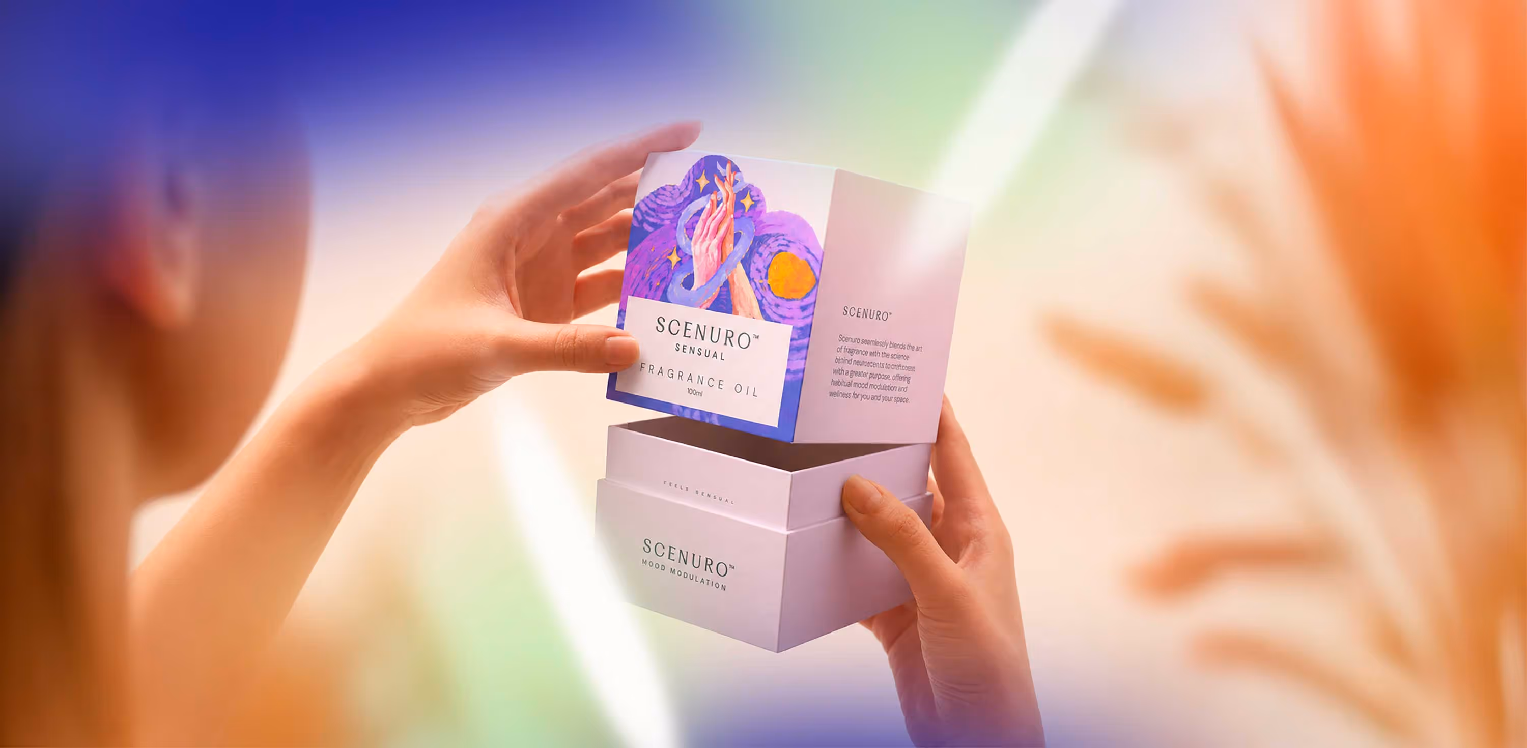
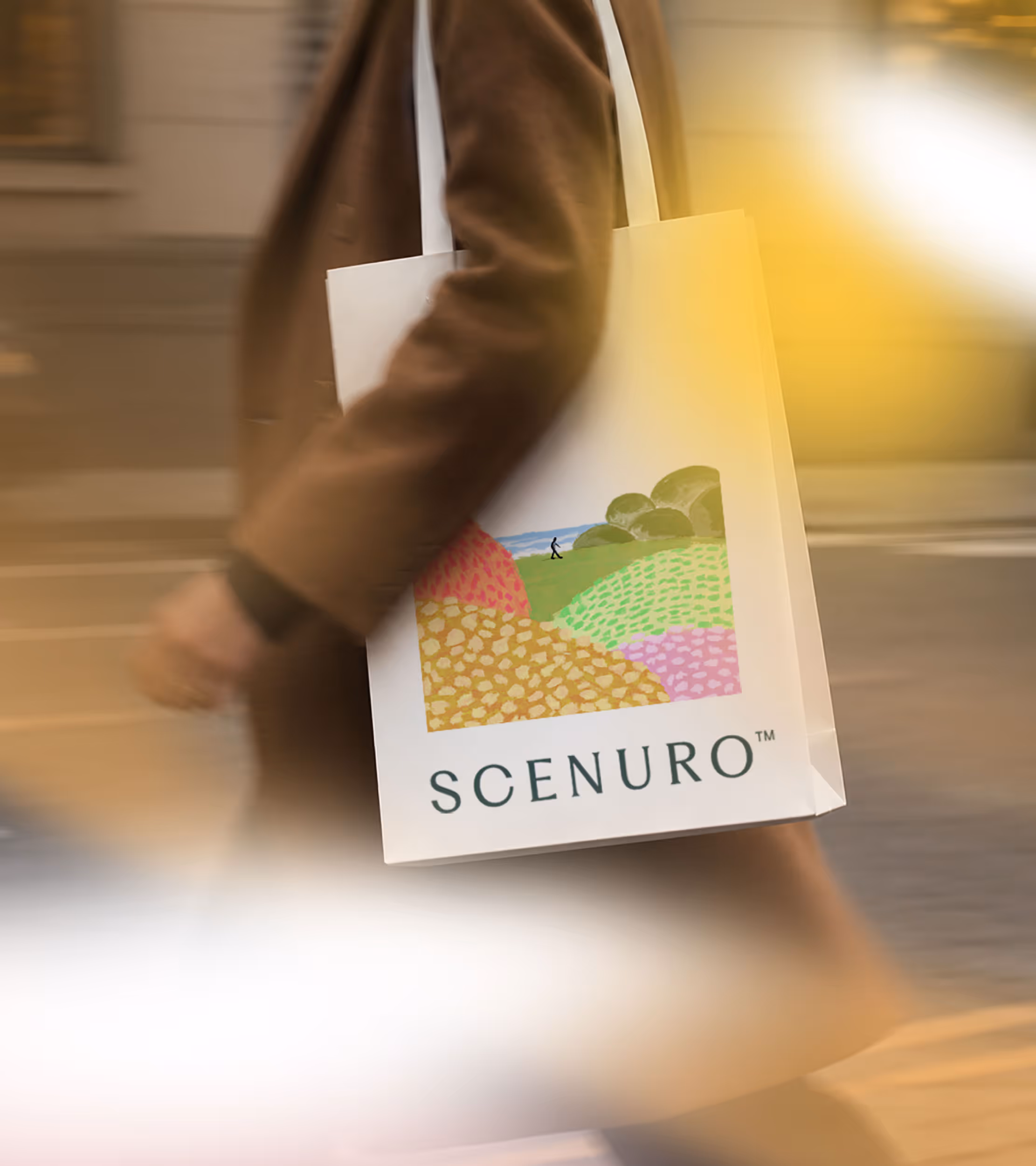
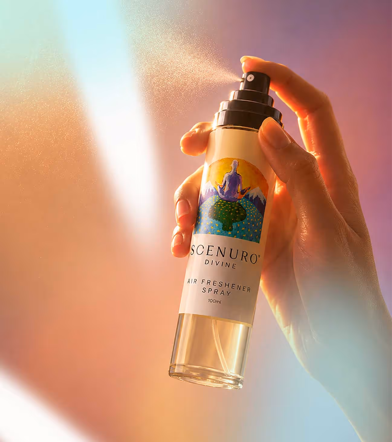
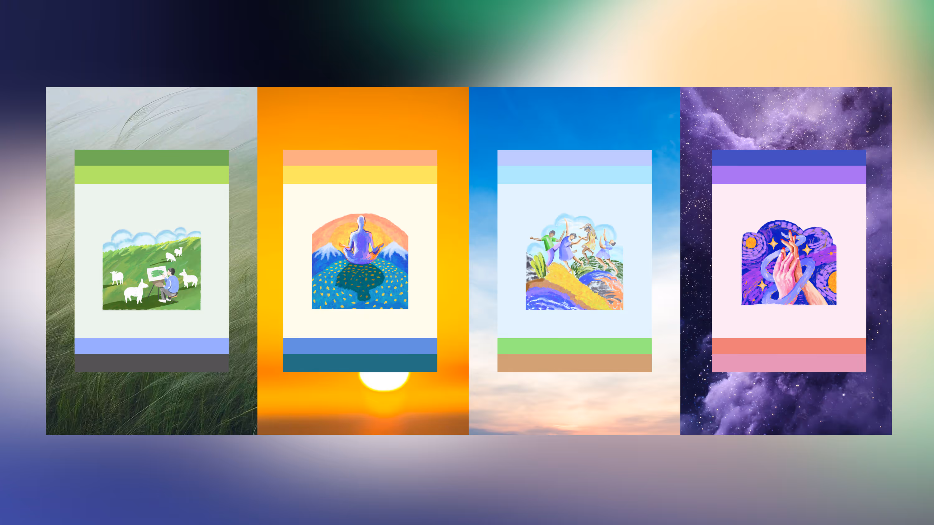
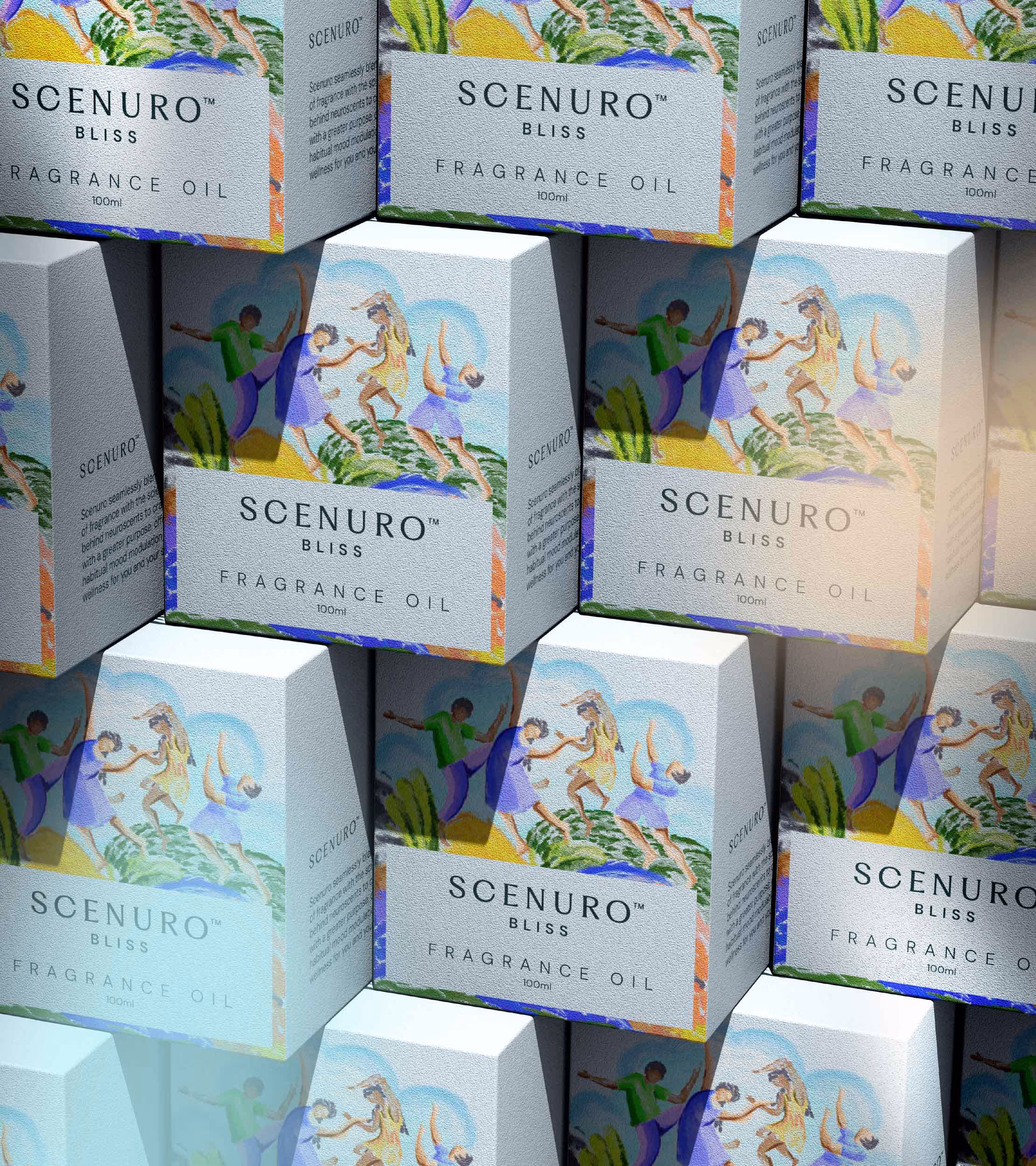
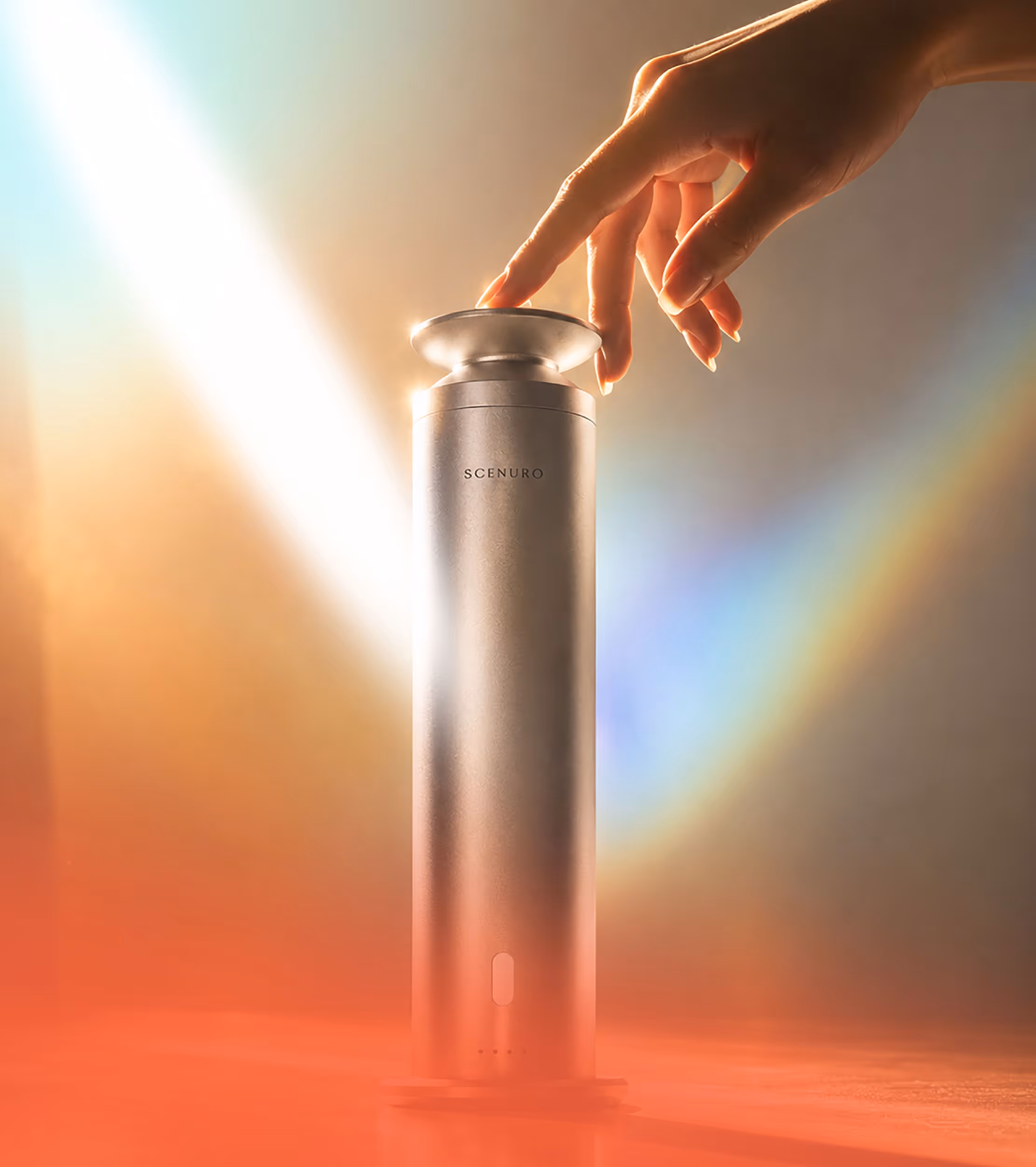
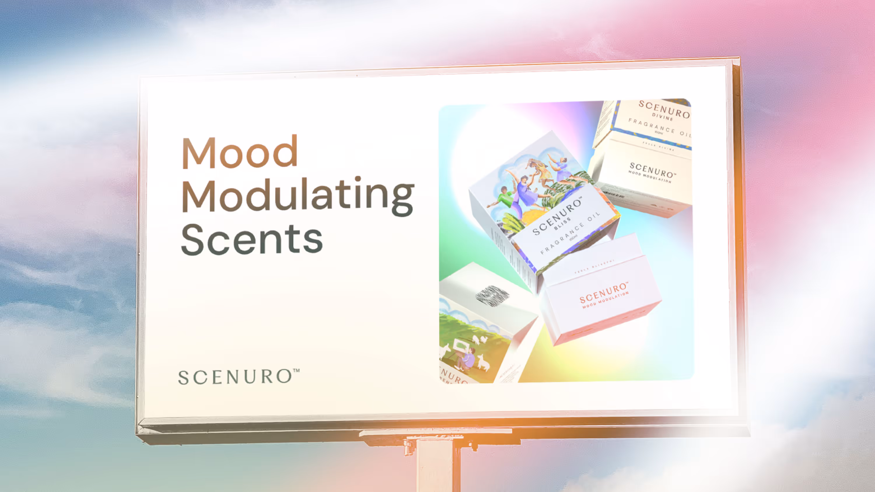
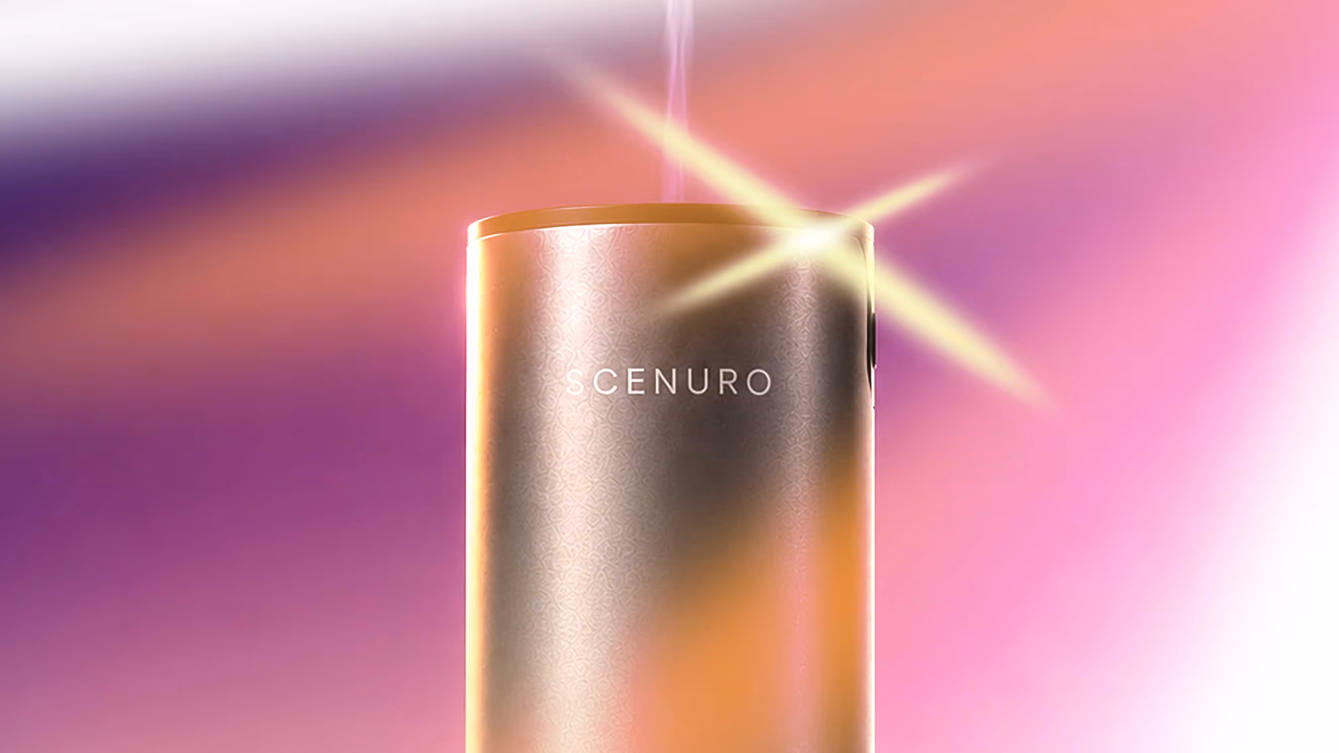
Scenuro
Most fragrance brands communicate what goes into the bottle. Notes. Ingredients. Origins. Scenuro needed to communicate what comes out of it. Built on neuroscience, Scenuro's fragrances are designed to modulate moods, shifting how people feel, not just how they smell. The challenge was to make that promise visible. Showing ingredients wasn't enough. Showing fragrances wasn't enough. If the product was designed to create an emotional response, the packaging needed to do the same.
So instead of visualising the scent itself, the packaging was designed to visualise its effect.
Inspired by Impressionism, the illustrations captured atmosphere, movement and feeling before they became something the mind could fully name. Each fragrance was given its own emotional world through illustration, colour and information. Together, they formed a packaging system that made mood modulation tangible, turning every candle, diffuser and fragrance oil into an extension of the experience itself.
Brand Language & Packaging
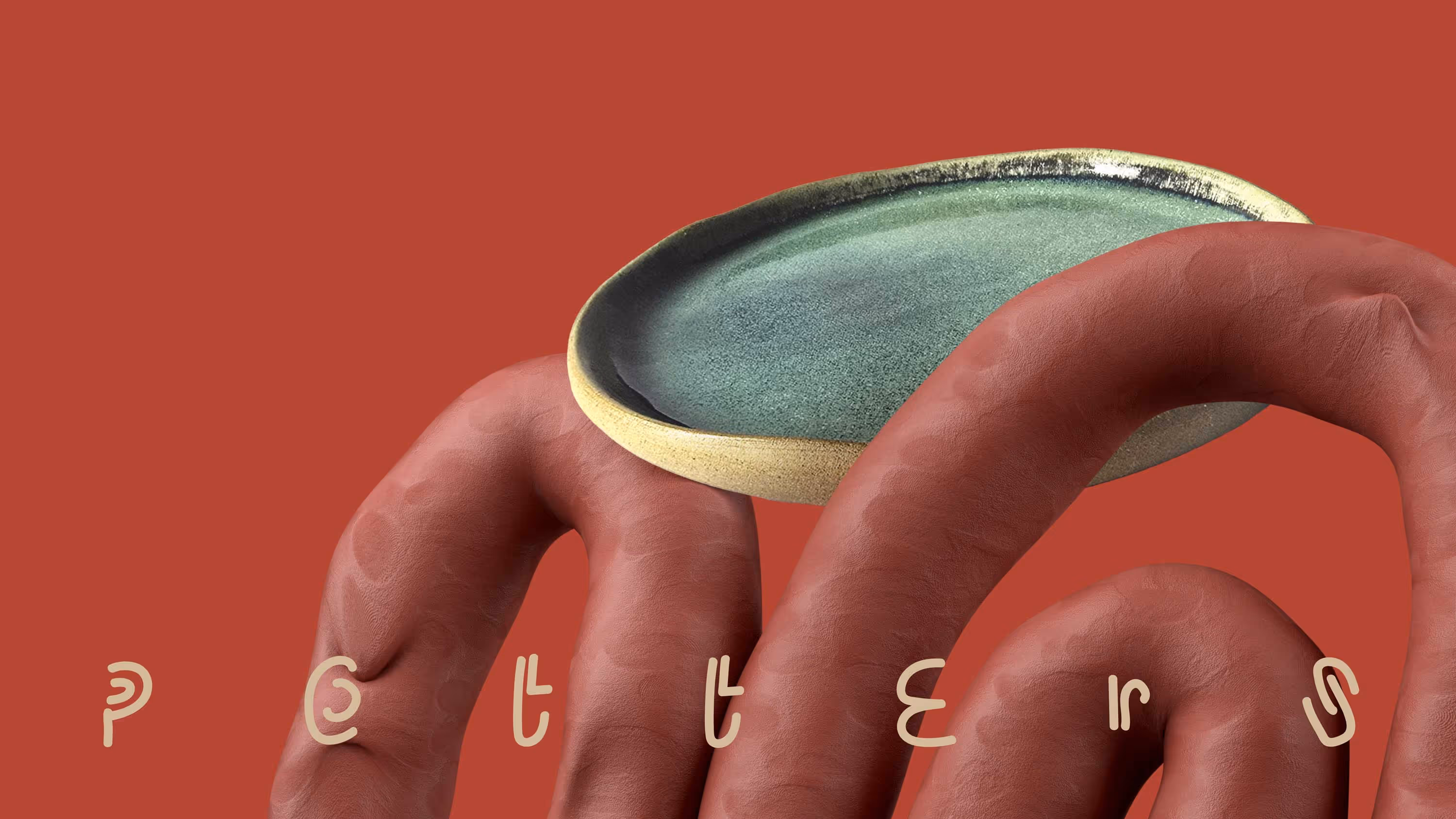
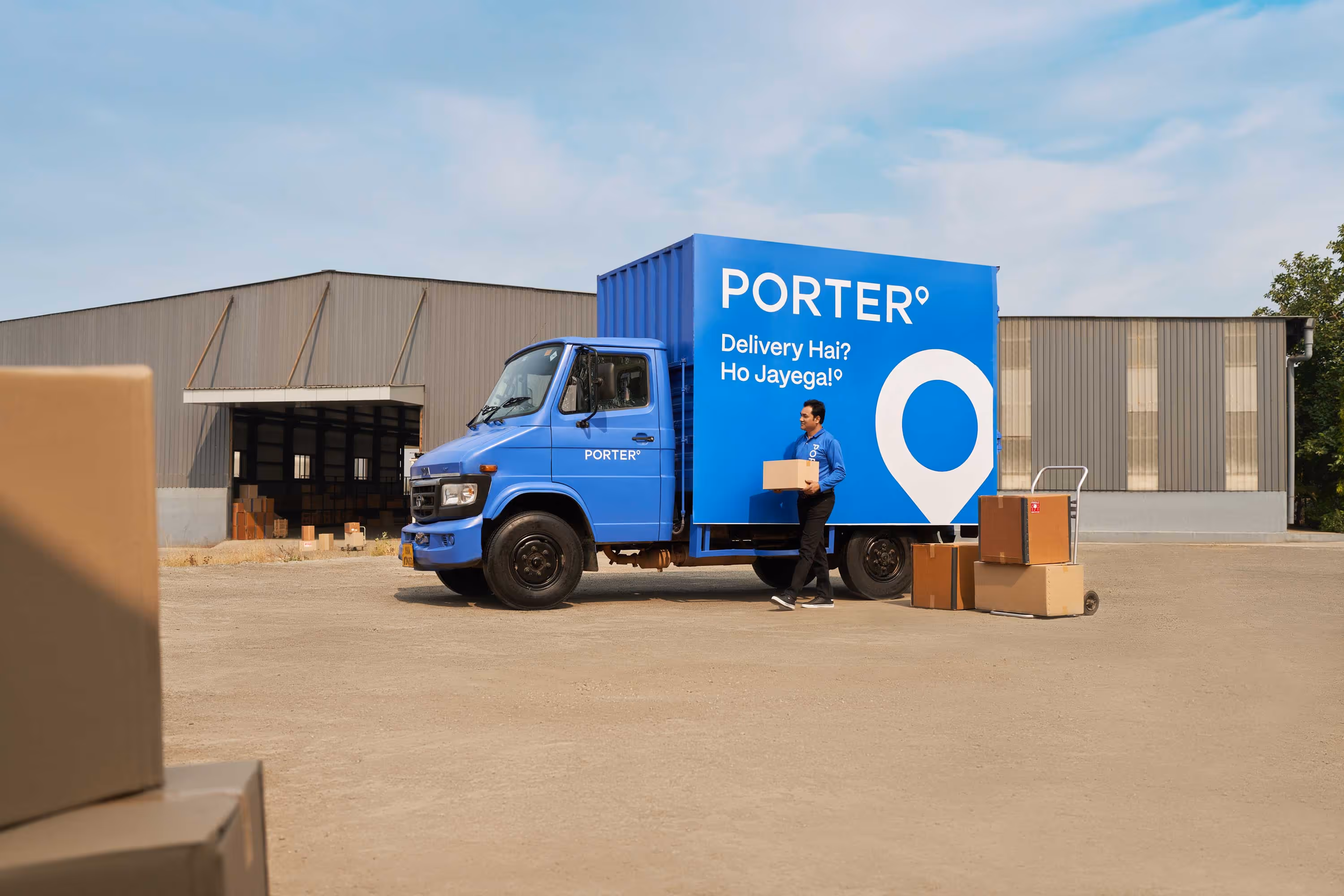
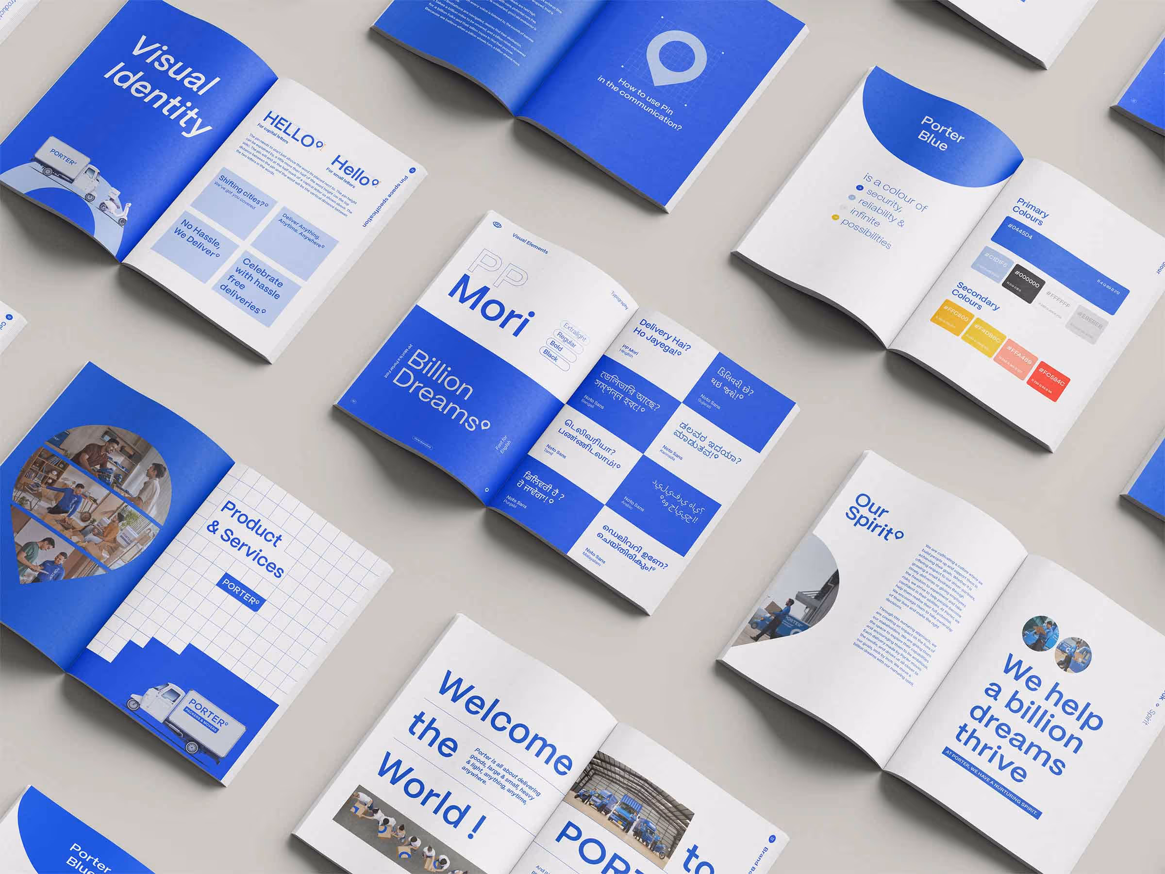
Porter
In 2014, Porter had a vision to transform the way goods are transported around cities. Today, they are revolutionizing the last mile logistics sector.
As Porter's core ethos revolves around the movement of goods, the location pin was central to the old Porter logo. Without losing its essence, the pin had to be reimagined in a fresh way. So instead of dropping it, we raised it!
For the new, simpler and streamlined logotype, the pin was designed as a superscript—a symbolic nod to latitude and longitude degrees, representing the corners of the nation that Porter delivers.
The new Porter brand identity embodies simplicity and dynamism, which is consistently illustrated across all Porter elements in the offline and online worlds. The pin, now an integral design element, rests in its rightful place, just like brand Porter, at the top.
Design Language & Communication
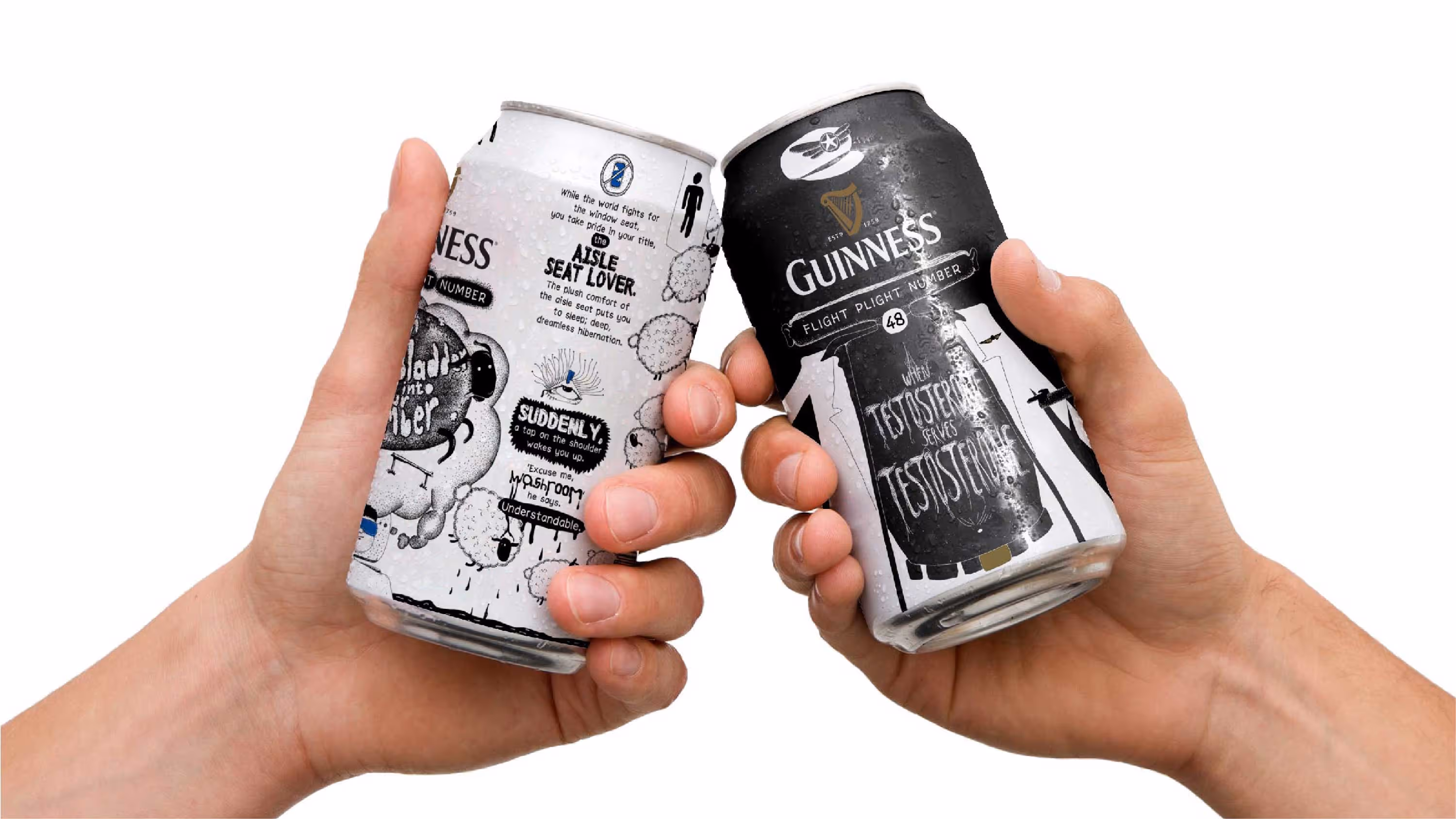
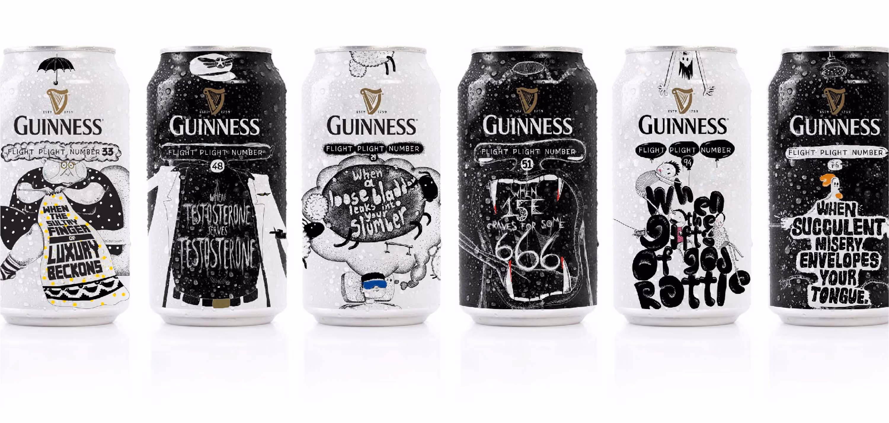
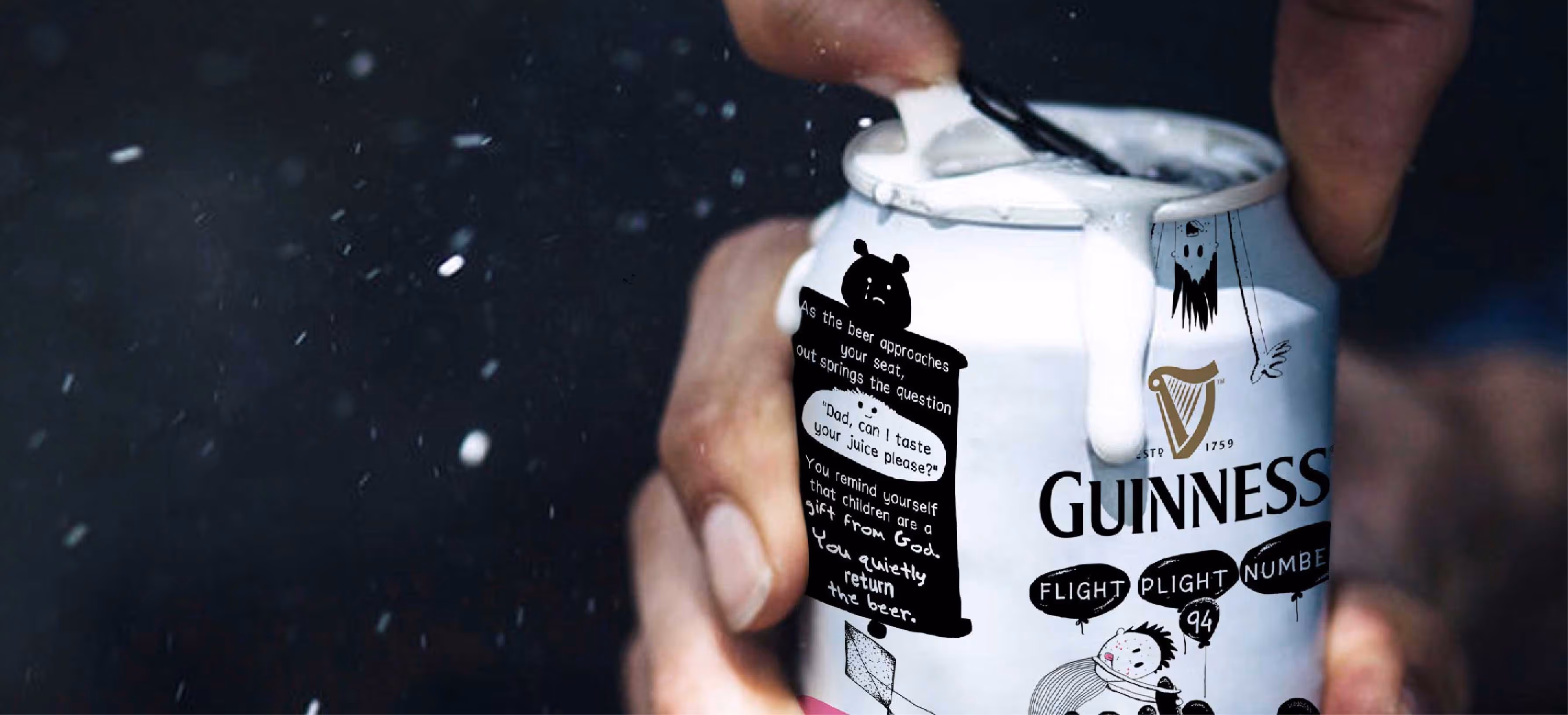
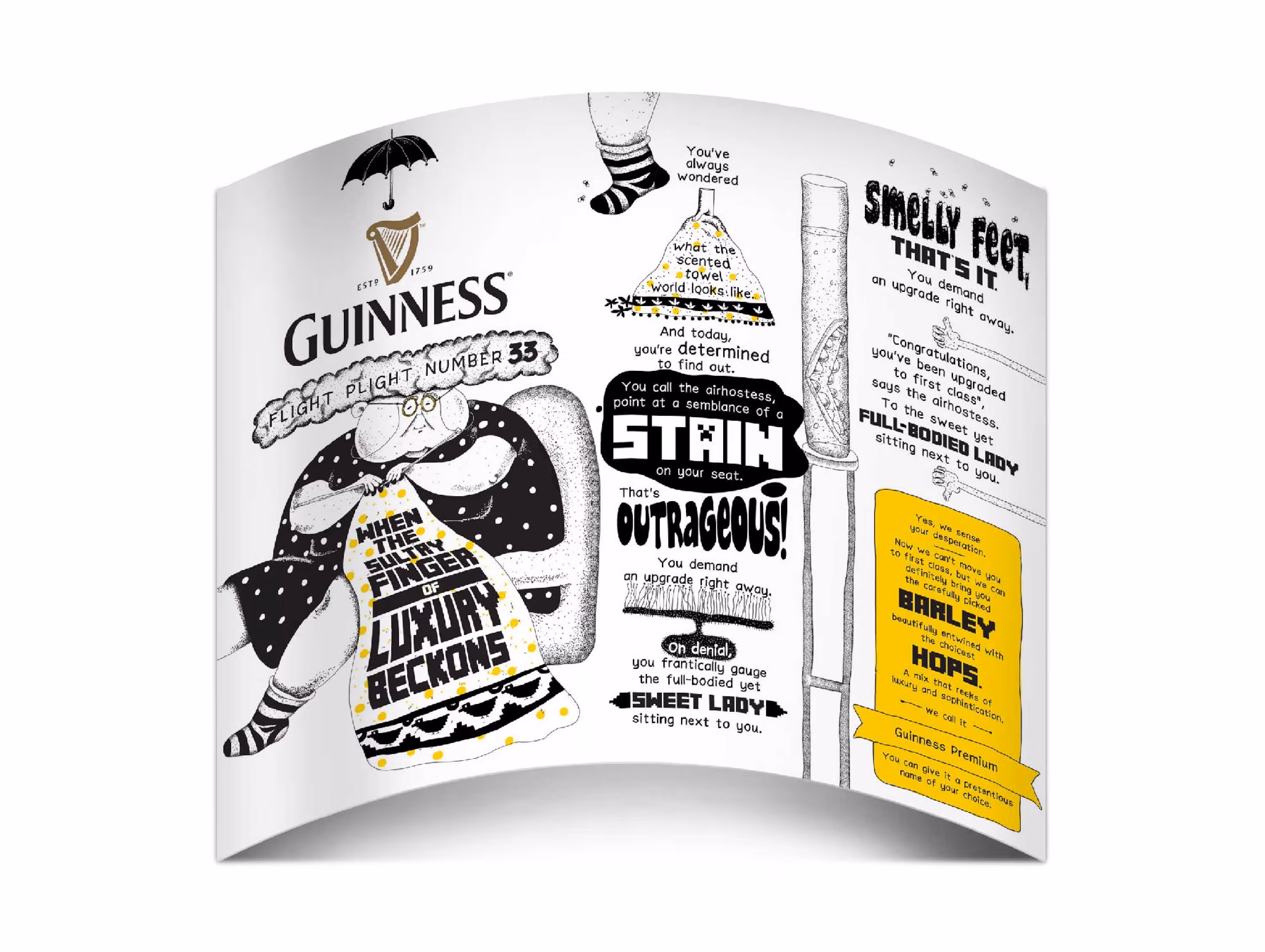
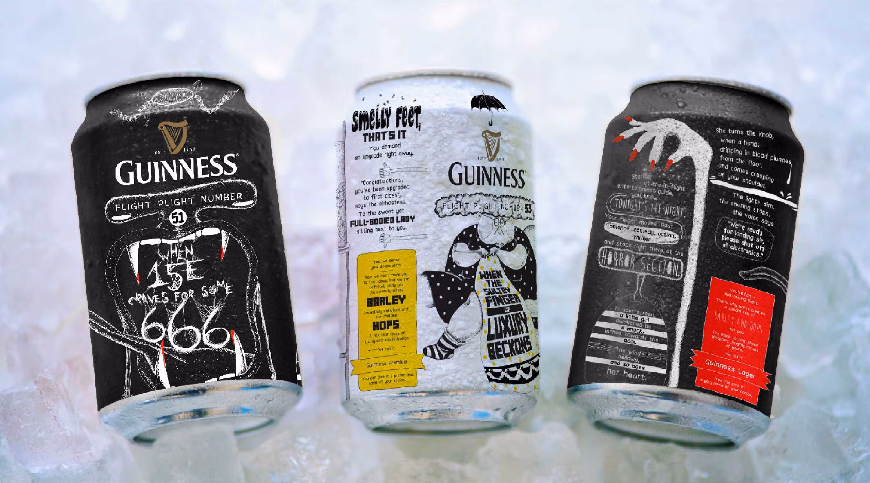
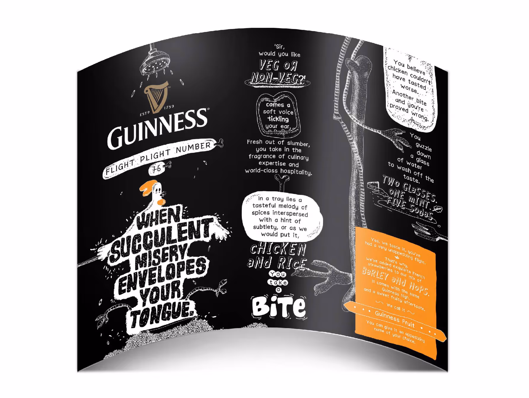
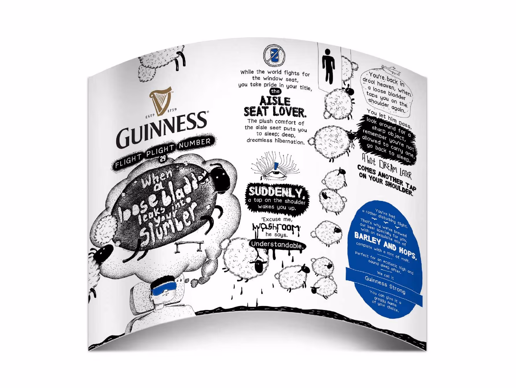
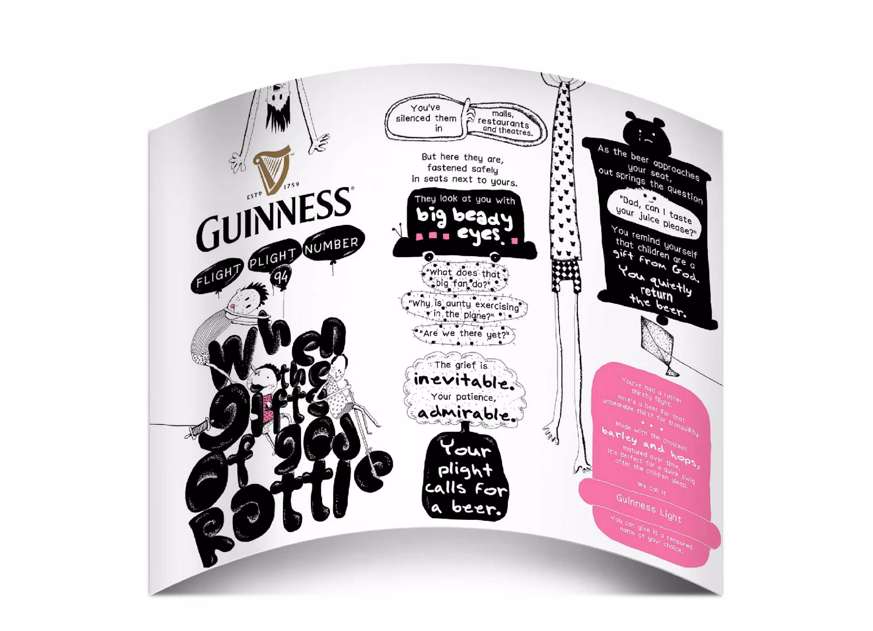
Guinness
Flying is essentially agreeing to spend a few hours in a metal tube with strangers while pretending everything about the experience is completely normal.
The task was to create a limited-edition packaging series for Guinness that would only be available on flights.
We built six different packs, each celebrating a relatable in-flight plight. From the person who falls asleep on your shoulder to the battle for the aisle seat, every illustration and headline turned familiar annoyances into stories people could instantly recognise and laugh about.
A packaging system designed not to improve flying, unfortunately, but to make it a little more entertaining.
Brand language & Packaging
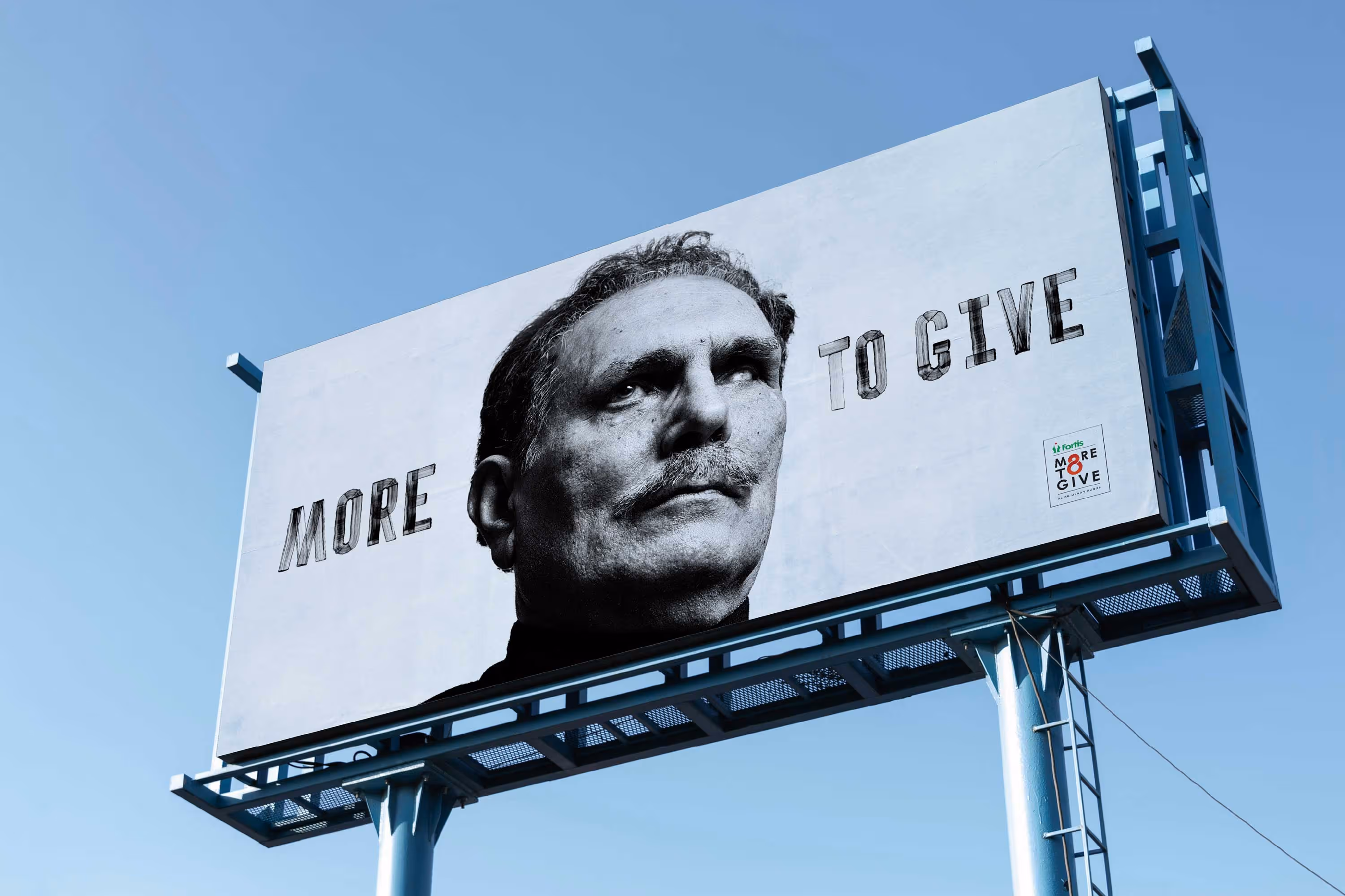
Fortis
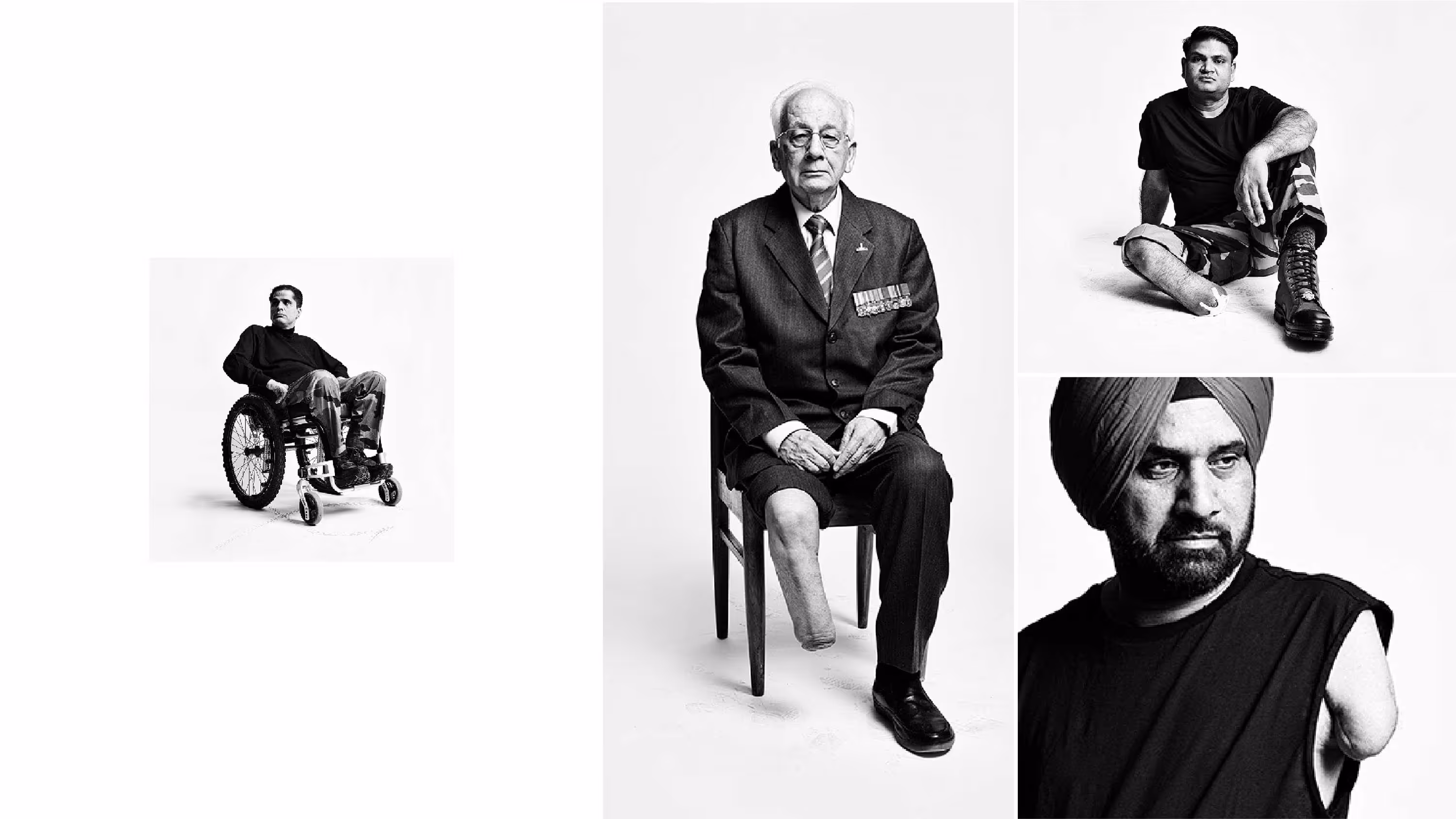
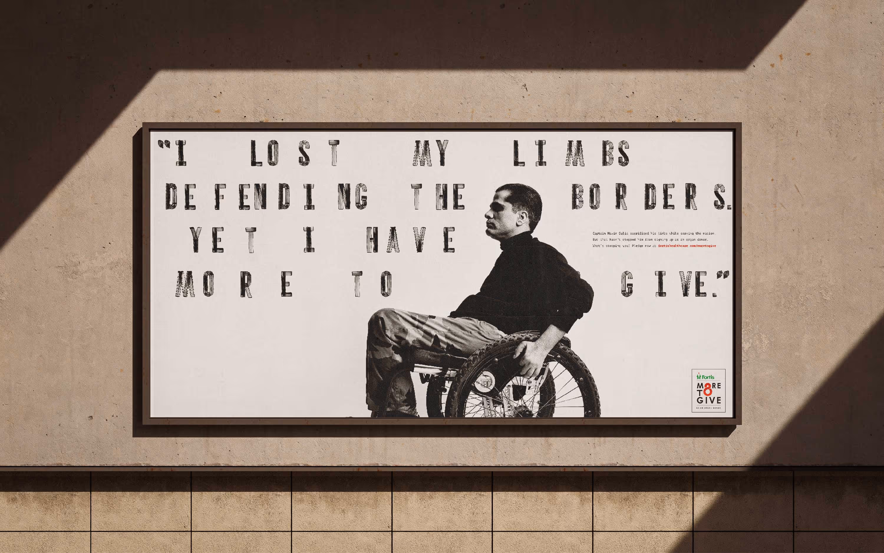
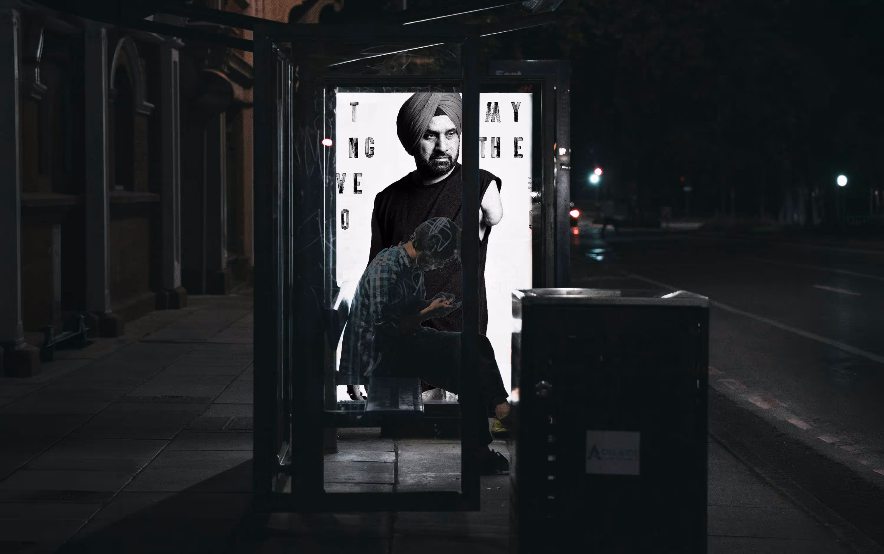
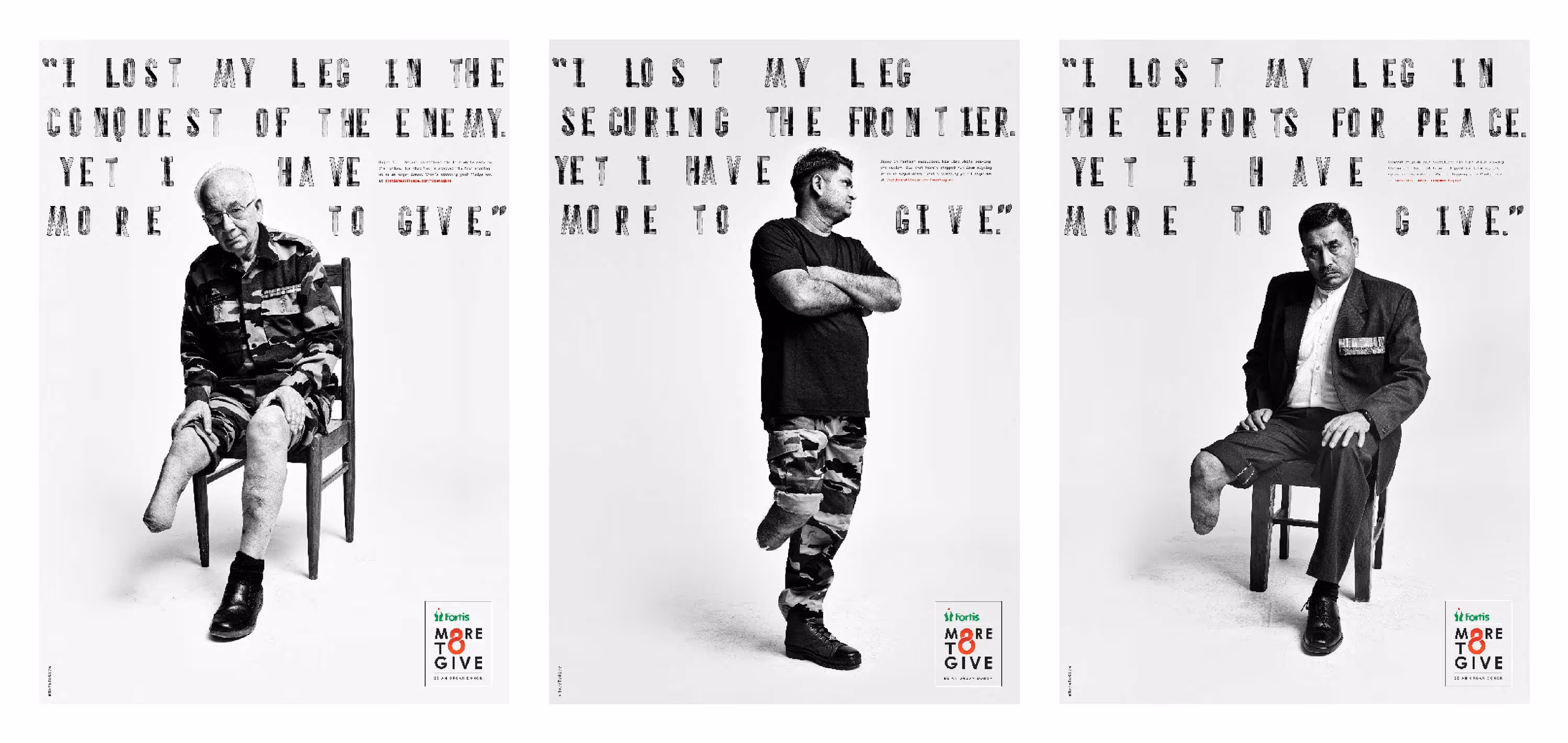
Organ donation is one of the greatest gifts a person can leave behind, yet it remains one of the least discussed.
For Fortis Hospitals, we created a campaign that spoke about giving through the voices of those who know sacrifice intimately. Retired armed forces officers who had lost limbs while defending the country became the ambassadors of the initiative.
Their message was impossible to ignore: I may have lost a limb defending the borders, yet I have more to give.
Built around honest portraits and simple typography, the campaign turned stories of personal loss into a powerful call for generosity. Because even after giving so much, some people still find a way to give more.
Design & Communication
About me
I'm an ideas person who happens to think in design. / I'm an ideas person who finds new ways to express them through design every time.
I find the one thing that's truly unique about a brand and build a visual world around it. Every logo, website, typeface, system, motion or brand asset starts with the same question: what is true only about this brand? Once that answer is found, design becomes a way to make people see it.My work is designed to stand out in crowded categories, but never for the sake of being different. Every choice has a reason. Every system has a role. The goal is always the same: create work that works for both the brand and the business.
I find the one thing that's truly unique about a brand and build a visual world around it. Every logo, website, typeface, system, motion or brand asset starts with the same question: what is true only about this brand? Once that answer is found, design becomes a way to make people see it.My work is designed to stand out in crowded categories, but never for the sake of being different. Every choice has a reason. Every system has a role. The goal is always the same: create work that works for both the brand and the business.
Awards
One Show = Bajaj Nation's Bike
Kyoorius Blue Elephant = Porter branding
Kyoorius Baby Elephant = Boon branding
Kyoorius Blue Elephant = Meymey branding
Kyoorius Baby Elephant = Meymey Typeface
Kyoorius Website Shortlist = moshimbo.com
IF Design = Boon App (UI/UX)
My dog pictures
Museum of Branding
This is a Lourve of my Paris
Custom Typefaces
Proof that I take Kerning personally
Meymey
Brand Language & Typeface Design
Boon
Naming, Rebranding, System Design, UI & UX
Is this even art?
Naming, Branding, Product & System Design
Jeep
Design Language & Communication
Zosh
Branding, Typeface Design & Packaging
Scenuro
Brand Design & Packaging
Porter
Rebranding & System Design
Guinness
Brand Language & Packaging
Fortis
Design & Communication